Have you ever chosen colors you loved, only to find the finished piece feels completely different than you imagined? Maybe it feels too heavy when you wanted lightness, or too calm when you wanted more pizzazz.
The secret to controlling your weaving’s mood just isn’t what hues you choose, it’s how light or dark those colors are. This quality, called value, determines whether your piece feels mysterious or ethereal, energetic or calm, everyday or dramatic
Value can greatly impact how we feel about color. For example, we might adore bright red, but despise pale pink or deep burgundy which are the light or dark values of the same hue. We respond to more than just colors alone: their relative lightness and darkness impacts how we feel about them and the emotion they convey.
Once you understand how value creates mood, you can design with intention, creating exactly the feeling you want. Let’s explore how the lightness or darkness of your colors changes the mood.
Color and Lighting
We react instinctively to lighting. Darkness makes us feel contemplative, somber, mysterious. Bright light evokes transcendence, purity, dream-like states. Medium light feels everyday and comfortable.
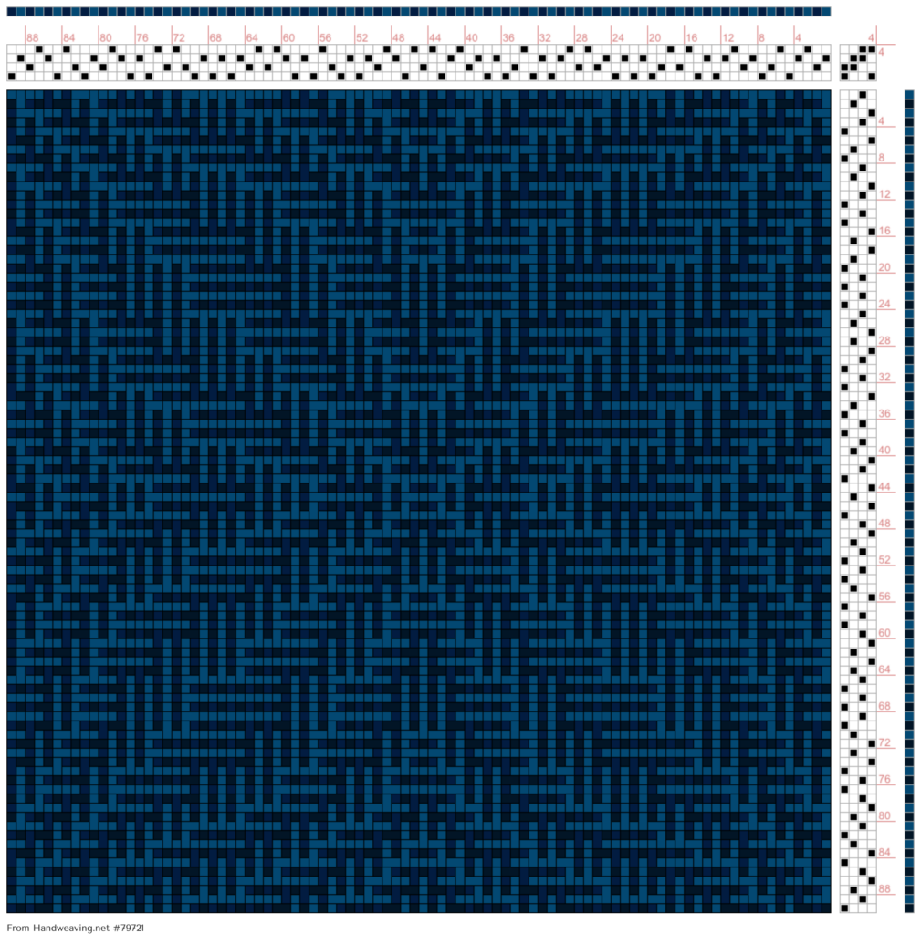
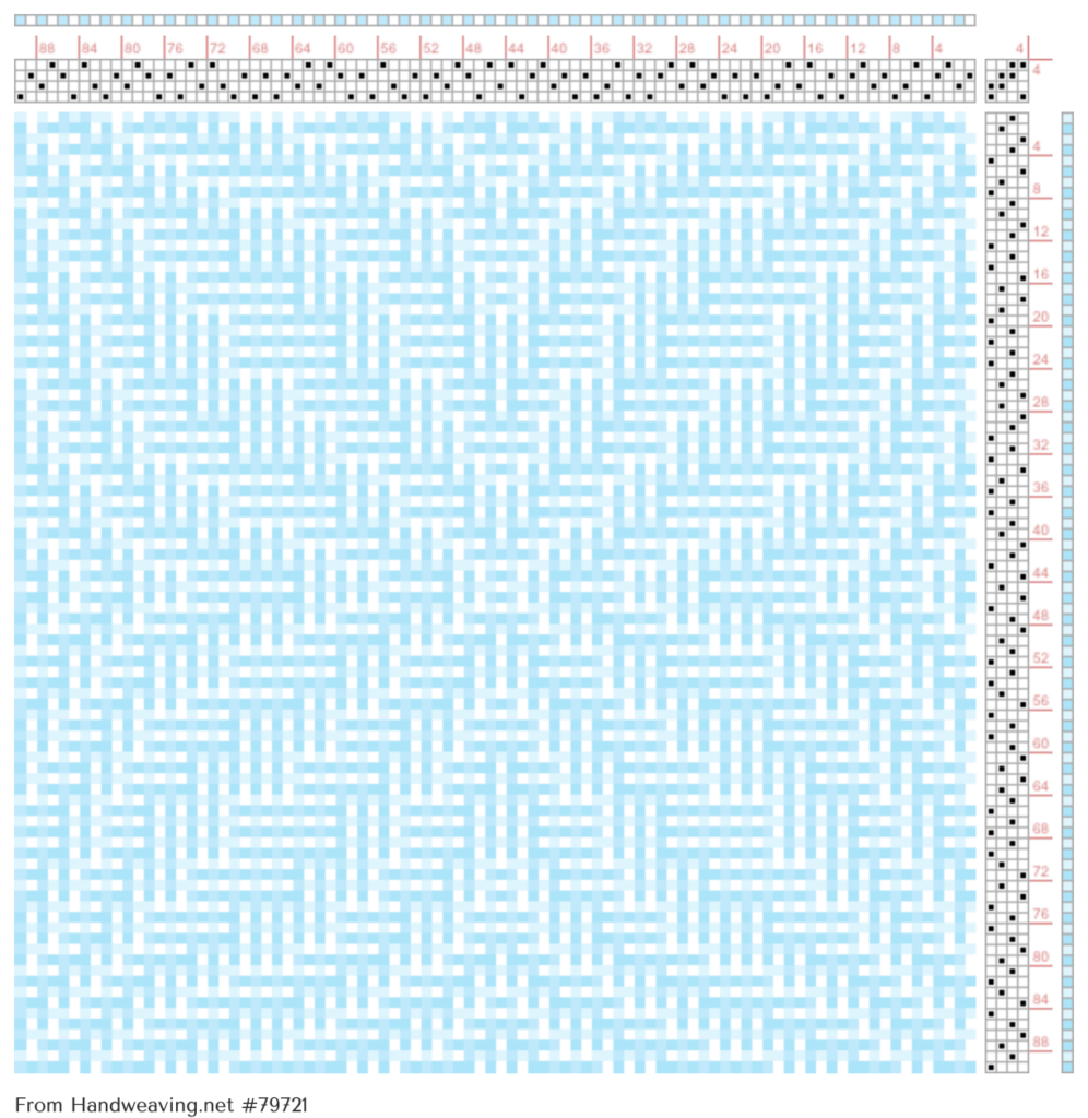
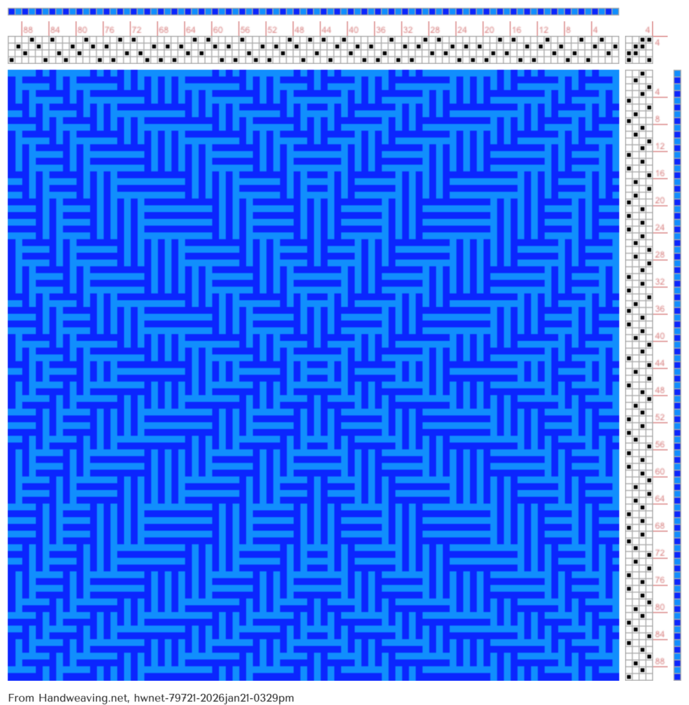
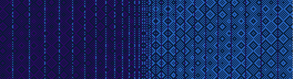
Your handwoven cloth’s values create the same subconscious responses. Let’s look at how using just the color blue impacts Handweaving.net draft # 79721 by Reena Meijer Drees.
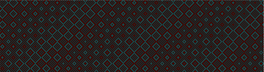
Dark values evoke the feeling of low lighting and cozy spaces. Pieces dominated by dark colors feel like nighttime, candlelight, shadows. They suggest rest, mystery, regal solemnity, or somber contemplation. Even with varied hues, predominantly dark values create a serious, introspective mood.
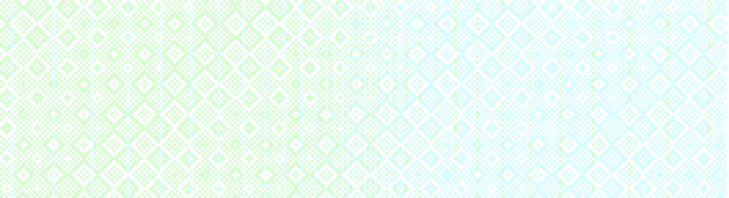
Light values evoke brilliant lighting. Pieces with mostly light colors feel flooded with sunshine, like beaches at noon or rooms filled with natural light. They suggest meditative calm, surreal transcendence, or spiritual purity. Light-value pieces feel ethereal and otherworldly.
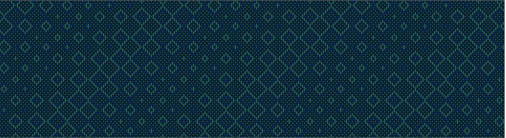
Medium values feel everyday. Neither dark nor light, medium values evoke the ordinary activities of daily life. They feel natural, approachable, comfortable, the colors you’d encounter during your most active hours.
These examples show how a single hue, blue, can evoke many different feelings, just by changing its darkness or lightness.
Designing with hue and value
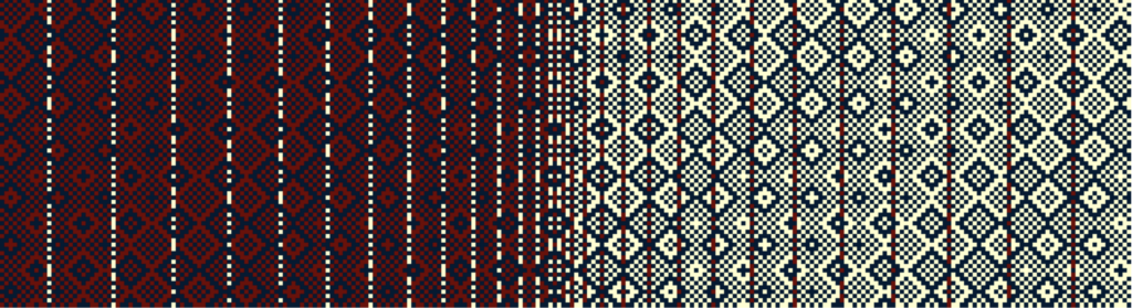
Let’s explore how hue works with color. The following examples are made using Handweaving.net’s #74558 by Miranda Benson.
For mystery and depth: Select dark values. Contrasting hues (far apart on the color wheel) will produce a dynamic feel, while similar hues feel more harmonious. In the drawdowns below, the first uses contrasting hues and the second very similar ones.
For ethereal calm: Keep everything light with minimal contrast, to give the impression of dream-like transcendence.
For everyday comfort: Medium values and similar hues feel approachable and friendly.
Contrasting values
Of course, you don’t have to use colors that are all dark or all light. A dark design with a few lighter highlights will still give a dark “mood” to the design while providing contrast, as in the draft below:
However, very light colors combined with dark colors can change the dynamics of a draft, adding drama and complexity.
Your Turn to Design with Mood
The next time you plan a project, don’t just imagine your favorite colors- think about the mood or “energy” of the design.
What do you want it to feel like? Energetic? Calm? Mysterious? Everyday?
Choose your overall value – light, medium, dark – to evoke the mood you prefer. Add lighter or darker highlights to give the design a more varied feel, or stick with one value if you want intense emotional focus on that one lighting level.
Understanding value and its effects gives you conscious control over what was once instinctive. You’re no longer hoping a piece will feel right – instead, you can create the exact emotional experience you want your viewer (and yourself) to feel.

Want to dive deeper into value and design? Tien’s complete Value in Design course covers creating mood in much more detail, and also helps you create bold or subtle patterns in your weaving. Join the Academy to learn how to create beautiful weaving with strong visual impact.