If you’re like me, you’ve probably had at least one project disaster where you sat down at the loom and got a crushing disappointment – totally different from what you expected. This blog post will explain how to anticipate and avoid those unexpected color disasters.
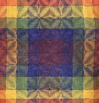
First, if you’ve had color disasters, you aren’t alone. Virtually everyone’s had them, including me. One of my first color disasters looked like this:

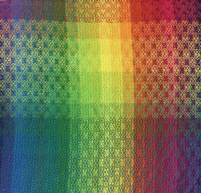
I had intended a pretty rainbow piece, more like this:

But I didn’t know that red and blue don’t produce bright purple when mixed in a dyebath (they produce dull purple instead), or that dull purple and gold, when woven together, produce purple-bronze. I’m sure that in the right context, somehow, that might have been attractive, but I thought it was butt-ugly!!

Another disaster was this bookmark that I wove early on in my weaving career. (The colors were so awful I didn’t bother finishing it!)
I thought orange and sage green would be pretty – the orange would shine brightly against the sage-green background. I was horrified when the orange and sage green blended together, and – worse – the pattern disappeared.
Here’s what created my disasters.
First, I didn’t know what I was doing – I was trying something entirely new, where I hadn’t developed any skills or knowledge. That’s not a bad thing! I was stretching my boundaries, growing as an artist. But it meant that I was out on a limb, taking creative risks.
Second, I wasn’t testing my ideas before trying to create them. I was going directly from my idea to the loom, assuming that everything would work out fine. That’s okay when you’re doing something familiar, something where you know what you’re doing and you’ve worked out all the kinks before. It doesn’t work nearly as well when you’re doing something new, unknown, and challenging. That’s because when you’re doing something new, you’re inevitably going to make mistakes. It’s part of the learning process.
So if you don’t test your ideas before going to the loom, you won’t find your mistakes before you make your project. If you don’t find the mistake before you make your project, then you’ll discover them in the finished project. And that’s how project disasters happen.
Let’s get one thing straight, though: The fact you will inevitably make mistakes when you try something new is NOT a reason to stick to the familiar! Doing new things is how you grow. Sticking to the familiar because you’re afraid of screwing up is a huge error – in fact, it’s the biggest and most disastrous mistake you can possibly make. It stops you from growing. These days, I get worried if I never make a blunder, because it means I’m not stretching myself.
I often tell hesitant students, “If you’re not making mistakes, you’re not learning. Go out and make some! Make them intentionally if you have to, but make some. Make friends with failure. Because if you’re learning, you’ll have a lot of small failures – and that’s a good thing.”
Now you’re probably wondering, “Okay, if mistakes are a good thing, how do I avoid screwing up my project with them?”
The answer is: Test, test, test. Test your ideas before putting that expensive project on your loom. Find a way to discover your mistakes before they worm their way into your finished project.
You may be squinting suspiciously now and saying, “But I hate weaving samples!” Don’t worry. Testing doesn’t necessarily mean weaving a sample. Though samples can provide valuable information, they are very expensive to produce, both in time and materials. They are my last resort. So I’m not talking about weaving samples – at least, not most of the time. Samples, if you choose to weave them, should come at the very end of the design process, after you’ve worked out all the other issues and just need a final sanity check.
No, the key to testing your ideas is to test early and often, and to test as cheaply and quickly as possible. Often that just takes a few seconds. The key is knowing what to look for. My class Sampling: A New Approach shows you twelve ways to sample!
For example, if you are selecting a color palette for your next project, and you want to know whether your pattern will show with a particular set of yarns, a quick way to find out is to take a black and white photo of the yarns. If there is enough light/dark contrast between the yarns you plan to use in warp and weft, then your pattern will show clearly. (Read about why this is true in the Understanding Value – Color Basics class) This is a great way to test your palette idea, and it takes only a few seconds.
The key is to match your testing methods to the stage of the design process, and always to check your design in the quickest, easiest way you can. Some people call it “being efficient.” I think of it as “intelligent laziness.” I don’t want disasters, but I also don’t want to put an ounce more effort into testing than I absolutely have to – it’s much more fun to weave than to test!
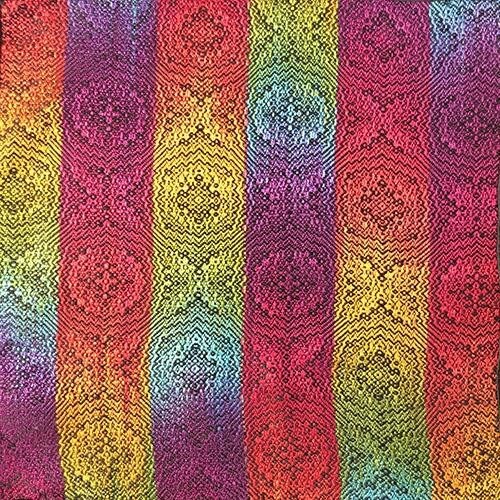
Meanwhile, enjoy this photo of a MUCH more successful rainbow swatch:

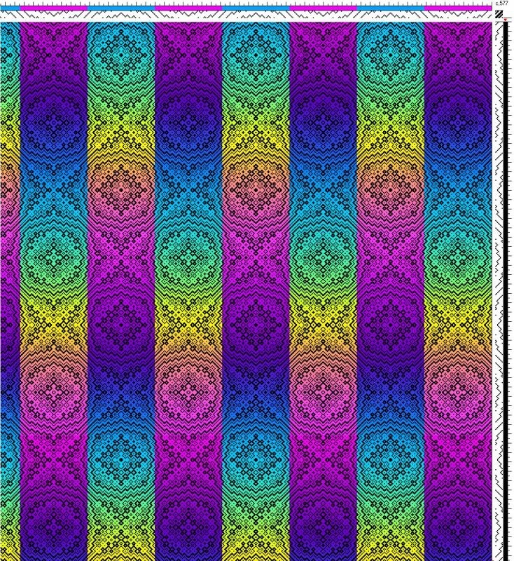
I did it after doing a much quicker digital sample. This one’s done in Photoshop, but I could just as easily have printed the draft and done it with colored pencil on paper:

They were both tests for my Kodachrome Jacket, which was published on the cover of the September/October 2011 issue of Handwoven.

I learned a lot while designing this piece, and I am quite please with how it turned out!
I encourage you to go and play with colors, and don’t be afraid to make mistakes, they don’t always end in disaster.
Happy weaving!

From the Course Catalog:

Color and Visual Design is a category that will have you immersed in the study of color, and how to use it to design your own projects.
