This is a sample lesson from Tien Chiu’s class Color Gradients. This class is available for Handweaving Academy Members.
What can you do with gradients?
Gradients are pretty, but that’s not all! They’re a powerful design tool that can help you:
- Blend colors together without hard transitions
- Preserve the flow of your woven pattern (the pattern in the draft) while shifting colors
- Create the illusion of depth and curvature
- Create the illusion of glow
- Change the mood and rhythm of a piece
When you use gradients intentionally, you can add subtlety, energy, or drama to your work.
Blend colors without hard transitions
Sometimes you want two colors to transition smoothly rather than abruptly. A smooth gradient lets you transition from one color to another without jarring the viewer or disrupting the flow of the design.
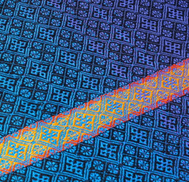
Preserve the flow of your woven pattern
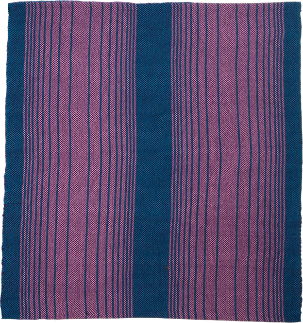
Conventional stripes will cut up the pattern in your draft. In the swatch below, the bands of color divide the woven pattern into visually separate areas.
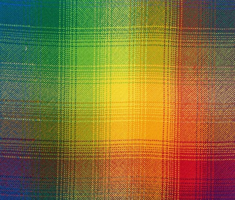
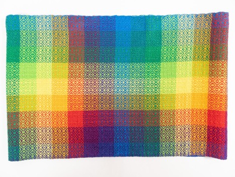
Smooth gradients, on the other hand, preserve the flow of the woven pattern because the gradual transitions don’t attract attention. This allows your woven pattern to flow smoothly throughout, as in the swatch below.
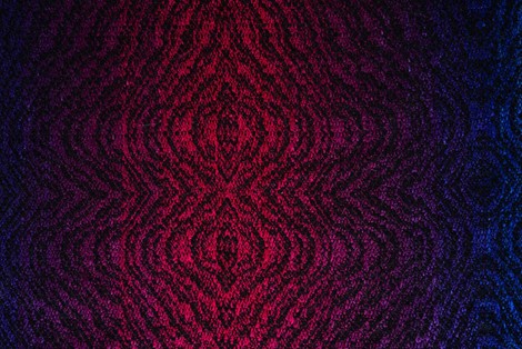
Create the illusion of depth
One powerful use for gradients is to create the illusion of depth. In nearby objects, the parts on top are usually lighter because they catch more light from above. Parts that are lower tend to be darker, because they have less light. You can mimic that effect by using value gradients – gradients that change from light to dark.
The two-color gradient napkin below gives the illusion of curvature, because the lighter color is concentrated in the center, with a value gradient falling into darkness on either side.
For things viewed from greater distances, like landscapes, the effect is a little different. As objects get farther away, they appear lighter, hazier, and less saturated in color. This happens because more atmosphere sits between you and the object, scattering the light and softening the colors. In weaving, we can mimic this distant look by creating gradients that gently shift from more saturated, darker colors in “nearby objects” to lighter, grayer, or less saturated colors further away (e.g. mountains in the distance).
Most of the time, in shaft-loom weaving, you’ll be using the first type of illusion. The second approach is more often used in tapestry weaving, which tends to be more pictorial.
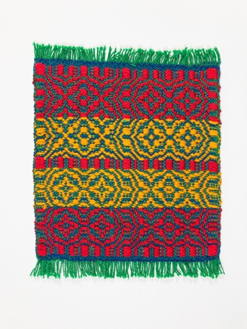
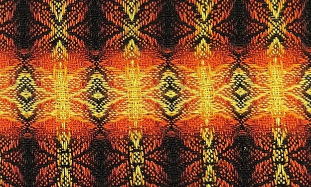
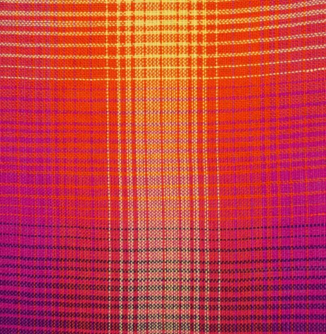
Create the illusion of glow
To create the illusion of a glowing object or stripe, use a gradient that starts lighter in the center and darkens toward the edges.
This mimics the way light naturally falls off from a bright center point. It can make your glowing stripe feel luminous – perfect for adding a magical feel or drawing attention to a particular area.
In this swatch, the yellow/orange/brown weft gradient creates the illusion of a glowing stripe.
Change the mood and rhythm of a design
Gradients gently guide the eye through a design. A smooth, subtle gradient draws the eye along smoothly, while a choppy, high-contrast gradient creates stopping points with a staccato rhythm and visual “beats”.
Here is a relatively smooth double gradient:
And below is a choppier gradient in the same colors. The more abrupt color changes create a different visual rhythm as each stripe gives way to the next.
Gradient rhythms need not be consistent throughout. The Fibonacci gradient, where adjacent stripes follow the Fibonacci sequence, provides a staccato rhythm as the stripe widths and colors change.
Gradients are a powerful tool for many things: color shifts, illusions of depth and glow, and visual rhythm. When designing with gradients, think about what you want to emphasize in the design, and how you want the eye to move. Then choose a gradient type that supports your design.
Summary
- Gradients aren’t just pretty. They’re a powerful design tool that can blend colors, shape visual flow, and shift the emotional tone of your piece.
- Use a smooth gradient to ease color transitions without jarring the eye – perfect for soft blends that don’t interrupt your draft pattern.
- Value gradients (light to dark) can mimic light and shadow, creating the illusion of depth or a three-dimensional surface.
- A gradient that starts light and darkens toward the edges can create a striking glow effect, drawing the eye like a spotlight.
Pacing in a gradient changes the mood and rhythm. Evenly paced gradients feel calm, while accelerating and decelerating gradients create depth and glow, and rhythmic gradients create bold visual beats.
