I am the first one to admit that in the past, I have avoided creating card wraps.
I was never quite sure WHY, but every time I had the opportunity to use them, I would essentially turn into an overgrown toddler, stamp my feet, and say “I DON’T WANT TO”.
Time has passed, and through courses, workshops, and my own growth as a designer, I have slowly changed my mind. Reflecting on the past, I realise that my hesitation to use this tool was most likely due to the fact that I didn’t understand the power of them.
Some time ago, I decided that I wanted to weave a gift for a friend, who had recently traveled south. This friend has a penchant for bright happy colours, and lives a pretty eco-friendly life.
So, I let those thoughts roll around in my mind for a while, as I clicked through an online album of their latest trip.
I decided that I wanted to weave my friend a set of napkins (eco-friendly) in cotton (easy care), and that I would use a plaid pattern, in the colors of her trip.
I played around with weaving software, but wasn’t happy with any of the variations that I came up with, and quite frankly, I got impatient changing a few threads here and there, then changing the colors, saving images, changing more things, and comparing the variations.
I had the colors that I wanted to use on hand, so I took a deep breath, and got out some cardstock, and started wrapping.
Here is the progression of that project.
I started out with this photo:

Then I looked around online for other similar photos, one of which I digitally took a “slice” from, for some colour inspiration.

I used that “Slice” to guide the first wrap.
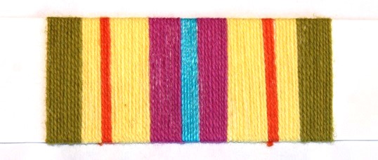
I did NOT like this one, at all. The green was the wrong colour, there was too much yellow, and while I generally prefer symmetry, this one was TOO symmetrical somehow. I didn’t think the centre section was awful though. (Keep in mind that this wrap was done in maybe 2 minutes, so it was a pretty low time investment).
I thought about what I didn’t like about the wrap, and decided that I wanted less green, more blue, and less yellow. So I dropped the green outer edges altogether, then used the idea of the asymmetrical yellow and orange section, but flipped it so there was a wider outer border with a smaller amount of yellow, and I used a narrow, wide, narrow pattern for the centre section, keeping the bright orange and pink that my friend likes, and just a touch of the green.
This was the result of those changes:
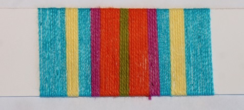
I liked this one quite a bit better, but it is a bit busier to my eye, and as I knew that I wanted to weave it as a plaid, which can essentially double the busyness, I thought I should simplify it.
For the third version, I went with mainly blue, dropped the green that wasn’t calling to me, and tried some narrow stripes of the brighter colours to keep the Caribbean feeling that I wanted.
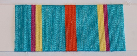
This one is definitely calmer, and I really like the yellow and orange with the blue, but the Magenta just wasn’t quite right. I like the overall layout, but it needs some work to get it “right”.
I then did another wrap (keep in mind that even with some distractions, and thought about what I liked and didn’t like, this entire process took maybe 15 minutes up to this point). I used the blue that my friend really likes (I like it too) as the main colour, I added a bolder stripe in the middle with the orange and yellow, and then reflected that on the edges, with delicate stripes.
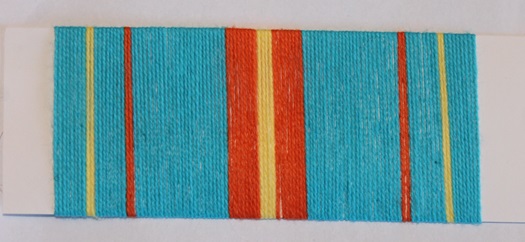
Now this one, I LIKED. I think that the yellow centre is bold, like my friend, but the orange borders keep it from overtaking the entire design. The smaller stripes add enough colour, again, without overwhelming the whole repeat.
I really liked the bright, happy, informal feel of this pattern, which I knew would perfectly suit my friends home, and outlook on life.
I then quickly put this design into my weaving software, not worrying too much about getting the digital colours exactly correct, as I had the real thing right in front of me.
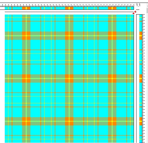
I really loved how the orange and yellow centre stripes in the original repeat form bright boxes of happiness.
I then wove the napkins, and I am so pleased with how they turned out.
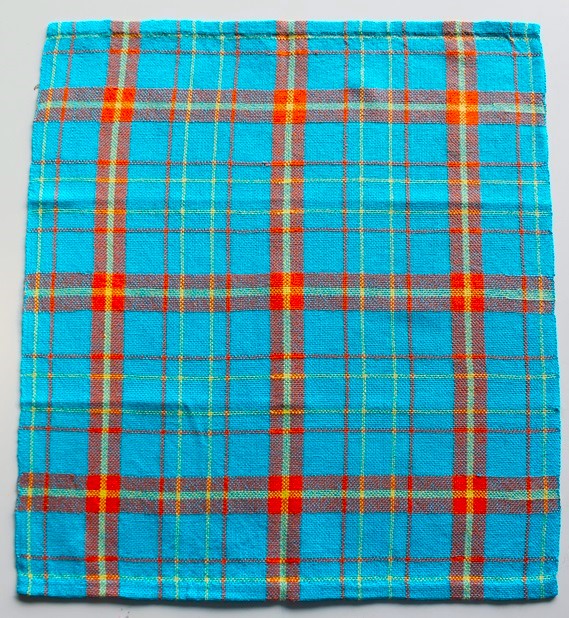
Choosing to use card wraps for this project was the best thing I could have done, as it allowed me to quickly play with colour and design, in a short time. This gave me a solid base to use to work out the details of the project, like the weave (it is so fast to change weave structure when you are using software!), the exact thread counts, and the amounts of yarn needed.
While I still don’t default to using card wraps as my first design tool, I am no longer afraid of them, and when my design is going to be stripes or plaids, and I just want to play with the the proportions and colours, I don’t hesitate to reach for my pile of wrap bases, which are photo mat board, cut to 2” x 6”, my stash of yarn, and get wrapping.
If you’d like to learn more about card wraps and how to use them, check out our Toolbox on creating card wraps!
From the Weavers Toolbox:
How to create a card wrap – Learn more about card wraps and how to use them.
