Using yarns whose colors clash can be a challenge when designing your own handwoven cloth. It’s easy for them to weave into fabric you dislike. But it’s not that hard to harmonize colors that don’t “go together”. This blog post will show you how to use clashing color combinations to make beautiful handwoven cloth.
Why do colors clash?
Let’s start by saying that “clashing” is a subjective response. Clashing is a product of color contrast – the difference between colors. Some people find high-contrast color combinations lovely and bold; others feel they clash. In general, if you feel two colors clash, it’s because they contrast more strongly than you like, either in hue (placement on the color wheel) or value (lightness/darkness).
For example, some people will enjoy the combination below, and other people will feel that the colors clash.
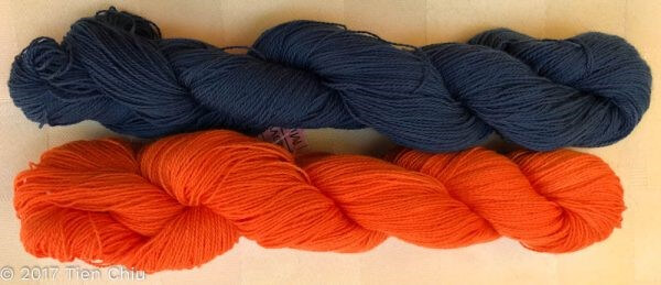
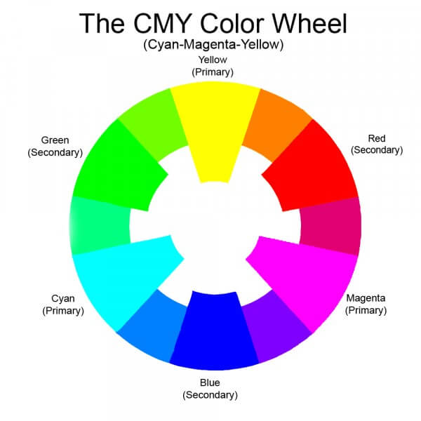
That’s because these two skeins have strong contrast – the navy blue is much darker than the orange, and blue and orange are nearly opposite on the color wheel, as you can see in the color wheel below:
This may be to some people’s tastes, and not to others.
If it is not to your tastes, then reducing the contrast between the colors will generally fix the problem.
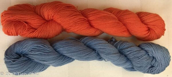
For example, when the blue and orange are nearly the same value (“value” is the colorist’s term for the darkness of a color), they look much more harmonious, as you can see in these two yarns:
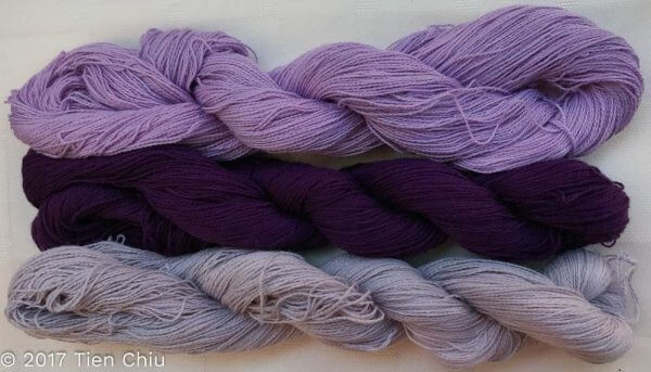
And when very light colors are paired with very dark colors of the same hue, they don’t contrast nearly as strongly either – as you can see in this photo of three purple yarns:
So in general, two colors contrast most strongly when they are far apart on the color wheel and one is much lighter or darker from the other. This means that those combinations are the most likely to be perceived as “clashing”. (Again, whether or not the high contrast bothers you is a matter of personal taste.)
Fixing clashing colors when designing handwoven fabric
Once you understand why colors clash, the solution becomes clear. If you can’t pick different colors – let’s suppose you already have the yarns – you need to reduce the contrast between adjacent colors so the combination isn’t so jarring.
There are two easy ways to do this. You can smooth the transition between colors by adding a third color (or colors) in between, one that harmonizes with both colors. Or you can blend both warring colors with a third color, one that reduces the contrast between them.
Using a “buffer” color to unify a design
The easiest way to fix clashing colors in your handwoven cloth is to pick a color that is compatible with each of the two contrasting colors, and insert it between the jarring shades. Neutral colors – black, gray, and white – are often used as buffers, because they have no hue, so they don’t clash with any other colors. However, colors that fall in between the warring shades in hue (on the color wheel), and in value (darkness), can work as well.
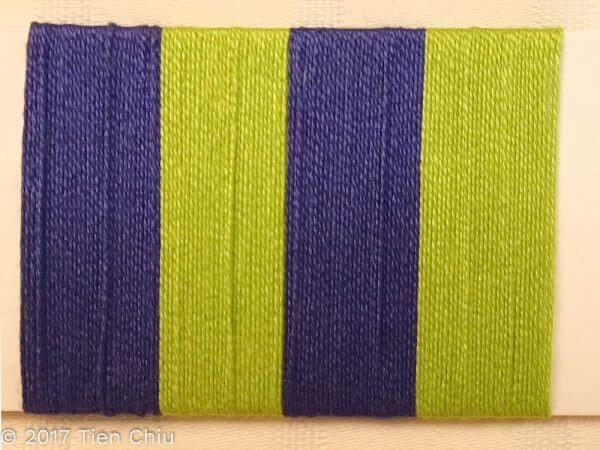
For example, this yellow-green and blue-purple jar the eye when placed together, because they are far apart on the color wheel, and one is much lighter than the other:
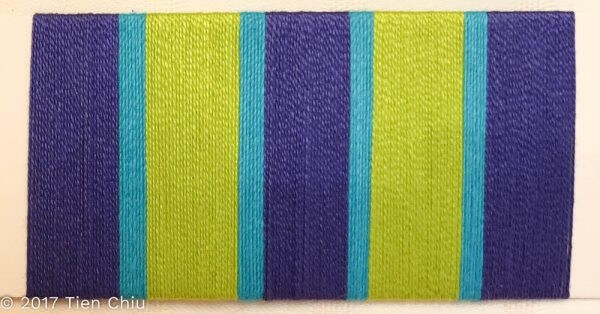
However, inserting turquoise to separate the two colors results in a far more harmonious design, because it falls between the lime green and the purple, both on the color wheel and in darkness.
Blending colors to reduce contrast
A second option for creating beautiful handwoven cloth from clashing colors is to reduce the contrast in the colors by mixing them with a third, carefully-chosen weft color. Plain weave works best for this, as it creates the smallest dots of color and thus mixes the colors together more thoroughly when seen at a distance. (More about optical mixing in my blog post “The Magic of Optical Mixing“.) But any structure with short floats can work too.
To pick a weft color, you need to consider how much of each color is present and what will blend best with each. In general, you’ll get more harmonious results if you choose a weft color that is similar in darkness to whichever color makes up most of the warp. It’s also helpful to choose a color that is close on the color wheel, or which is similar in brightness/dullness.
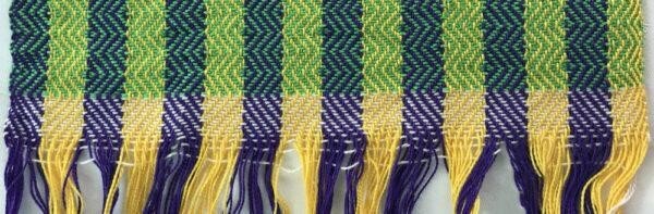
Here the high-contrast purple and yellow warp stripes are unified by a green weft, which falls between purple and yellow in darkness, and on the color wheel.
A real-life example
To see how this plays out in real life, let’s look at an example. These three yarns are from my stash.
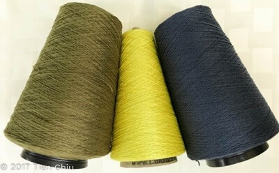
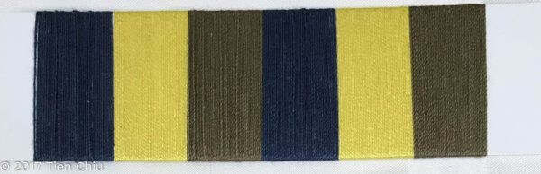
The lemon yellow is the troublemaker in this bunch. It is so light and bright that it contrasts strongly with the blue and (to a lesser degree) the olive green. If placed next to either color in pure form, it will jar the eye, as you can see in the card wrap below:
There are two possible solutions. The first is to add a transitional color between the yellow and the other colors, as we did with the lime green/purple combination. It needs to be midway between the yellow and the blue in darkness, and not clash with any of the three colors. Gray, being a neutral, is a safe choice. Here is a yarn wrap with light gray as a “buffer” between colors:
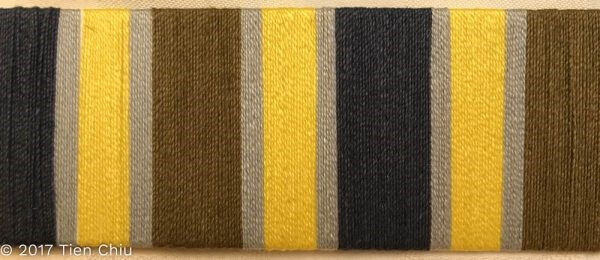
This reduces the contrast, but also loses the vitality of the original version.
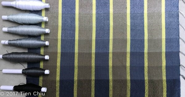
Let’s look at the other method, blending both colors with a third color. Here’s a yarn wrap showing stripes of yellow, olive, and blue:
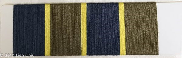
Since the blue and olive make up most of the design, we need to start by finding a weft that will blend harmoniously with both. The most important part is to choose a color that is similar in darkness to the blue and olive. It’s also helpful to choose colors that fall between blue, olive, and yellow on the color wheel.
Let’s look at darkness first. Neutral colors – black, gray, and white – are the easiest blending colors to use, because they mix well with all color families. But how light/dark the neutral color is also makes a difference. Here’s a color gamp woven with the yellow/blue/olive warp and various shades of black,gray, and white:
As you can see, the darker grays blend better than the other colors because they are almost exactly as dark as the blue and olive, so there isn’t much contrast between them. But they darken the yellow, making it more compatible with the blue and olive.
As you move higher or lower in the gamp, the contrast between the warp and the weft becomes much higher, giving a spotty-looking, less unified fabric.
Next, let’s look at colors that fall between blue and yellow on the color wheel.
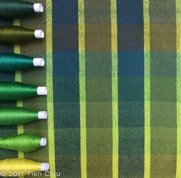
While most of the greens work reasonably well, the top four give noticeably more even results than the other colors. That is because they are just about as dark as the blue and olive, so they blend harmoniously with those two colors. And, of course, they darken the yellow and shift it towards green, which reduces the contrast between the yellow and the blue/olive.
If you blend with colors that don’t fall between the two clashing colors on the color wheel, the results look less unified. But colors that are about as light/dark as the dominant color still look more harmonious. Here’s a color gamp woven with a wide array of colors, shown in color on one side and black and white on the other:
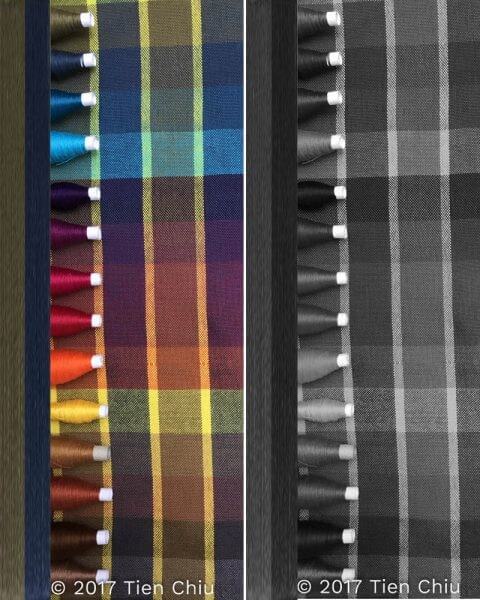
Because the blue and olive make up most of the piece, and blue is the color that contrasts most strongly with yellow, using a weft that is about as dark as the blue produces the smoothest-looking results. For wefts of similar darkness, the blues and greens are most compatible, but good results can be had with other colors, such as the reds in the middle and the browns near the bottom.
Conclusion
The best way to smooth the contrast between clashing colors when designing handwoven cloth is to add a third color, one that harmonizes with the other two. While you’ll need to experiment, usually this color falls between the two clashing shades, both on the color wheel and in lightness/darkness.
Once you’ve selected your third color, you can use it to harmonize your clashing colors. One way to do this is by adding stripes of a third color to separate the warring colors. Another way is to use the third color as weft, blending it with both colors to reduce the contrast between the two. (If you go this route, you will get the best results by choosing a color that is of similar darkness to the most-used warp color, and a draft that blends colors – plain weave or 2/2 twill are great examples.)
I hope this blog post has given you some ideas of how to tone down clashing colors! One of the biggest barriers to stash-busting is how to use colors that “don’t go together”; I hope this post enables you to overcome that, and use whatever colors you like.

From the Course Catalog:
Color Mixing 1 – Learn about optical mixing, and how to control it in your designs
Value in Design- Learn what value is, and how to use it in your designs
Understanding Value : Color Basics – Learn to determine value accurately