Want to know how to pick colors to make your draft pattern show?
The secret is the contrast in darkness (also known as value contrast) between the warp and the weft.
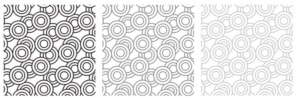
Value (darkness) contrast between colors is what makes any pattern easy or hard to see. In the image below, as the amount of value contrast between the lines in the pattern decreases from left to right, the pattern becomes less distinct, harder to see.
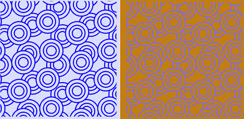
Hue contrast – how far apart colors are on the color wheel – does matter in making a pattern perceptible, but not nearly as much as value contrast.
To illustrate this, look at the image below. On the left, the blue and light blue are a single hue, with no hue contrast but lots of value contrast. The pattern shows clearly. On the right, the orange and blue are near-opposites on the color wheel, with lots of hue contrast, but they have almost the same value, making the pattern much harder to see.
These principles apply when weaving, too. The more value contrast (light/dark contrast) between warp and weft, the more clearly the draft pattern will show.
In the blue and orange swatch below, the yarns used are very different in hue – blue and orange are near-opposites on the color wheel. However, the pattern is still blurry and hard to see. That’s because the colors have very little value contrast – if you look at the swatch in black and white (next photo), the swatch looks almost flat gray.
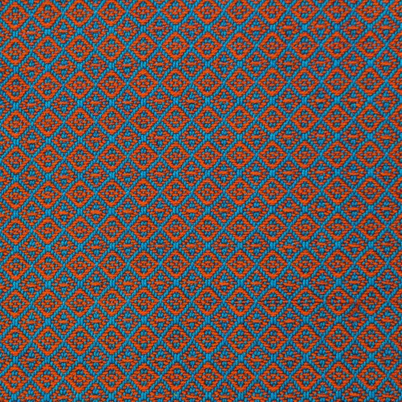
swatch woven with orange and blue yarns
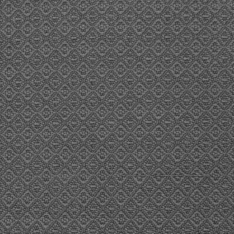
Black and white version of the same swatch photo
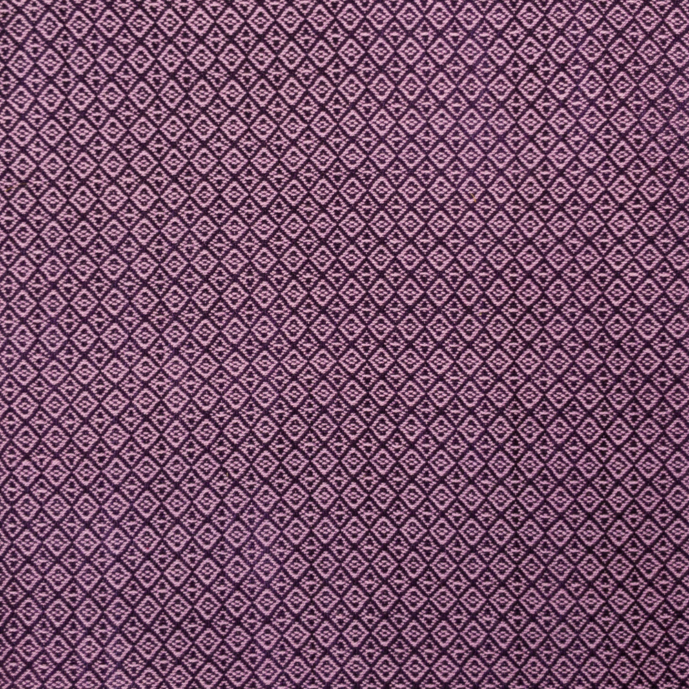
However, dark purple warp and light purple weft create a clear pattern, because of the strong value contrast between the colors.

If you want a clear, crisp draft pattern throughout, use colors with strong value contrast: a light warp and dark weft, or vice versa.
Playing with value contrast also allows you to transform a draft into many different looks. That’s the subject of our class Stripes + Drafts = Magic!

From the Community:
The Getting Started With Design thread in the Q&A/Share Your Work forum