Have you ever woven two pieces using the same structure, only to have one practically jump off the loom while the other whispers quietly? The difference isn’t in your threading or treadling. It’s in saturation.
Saturation is one of the most powerful (but often overlooked) tools in a weaver’s color toolkit. Understanding it can transform your work from hit-or-miss to intentionally stunning.
What Is Saturation?
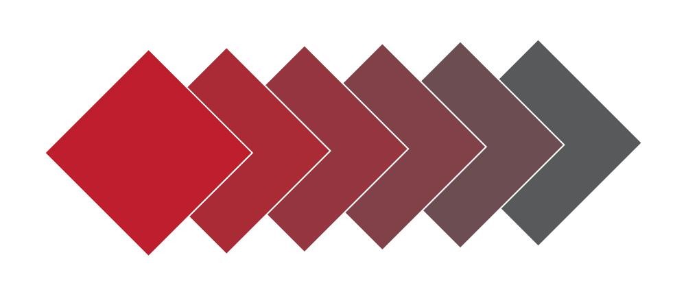
Think of saturation as the intensity or purity of a color. A fully saturated color contains no gray at all – it’s the pure hue straight from the color wheel. As you add gray to that color, you reduce its saturation, making it more muted and subdued.
Imagine a vibrant cherry red. That’s high saturation. Now picture that same red mixed with gray until it becomes a dusty brick red. Same hue, dramatically different saturation – and dramatically different emotional impact.
Interestingly, not all colors can achieve the same saturation at every value (lightness/darkness). Each pure hue hits its maximum saturation at a specific value level. Yellow achieves full saturation at lighter values, while blue reaches peak saturation at darker values. This is why a pale blue can never be as saturated as a mid-tone blue.
Saturation and Energy: The Vibrancy Factor
When it comes to design, saturation is the primary influence over how vivid and energetic a piece feels. This is one of the key components of mood in handwoven cloth.
High-saturation colors create high-energy pieces that feel vibrant and exciting. Low-saturation colors produce low-energy pieces that feel calm, subtle, and contemplative. Even when using the exact same hues, the difference in saturation completely transforms the emotional experience of the cloth.
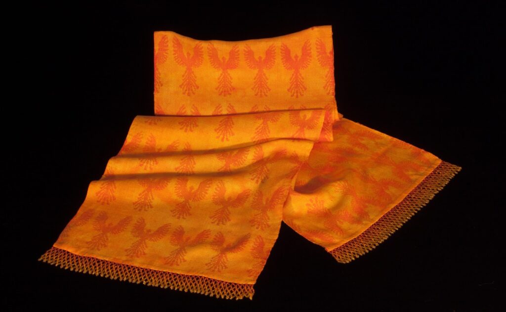
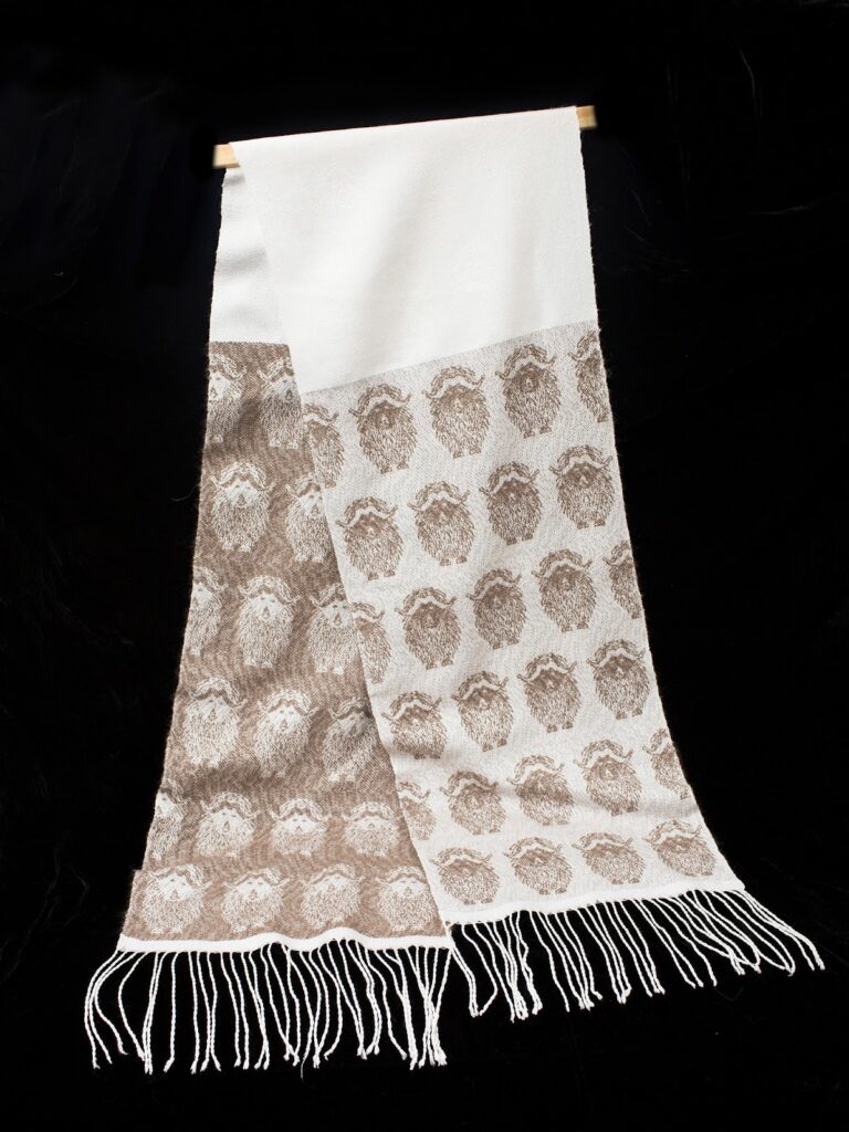
Consider these two scarves. One is woven in highly saturated orange, the other in low-saturation orange (aka brown). One is high-energy and attention grabbing, the other is subtly elegant.
The Chameleon Effect: When Colors Transform
Here’s where saturation gets really interesting: some colors completely transform when you reduce their saturation. Yellow, orange, and orange-red are the chameleons of the color wheel.
Reduce the saturation of yellow, and you don’t just get a duller yellow – you get olive. Lower the saturation of orange, and suddenly you have brown. These aren’t different hues; they’re the same hues with reduced saturation. Understanding this can completely change how you think about your color palette.
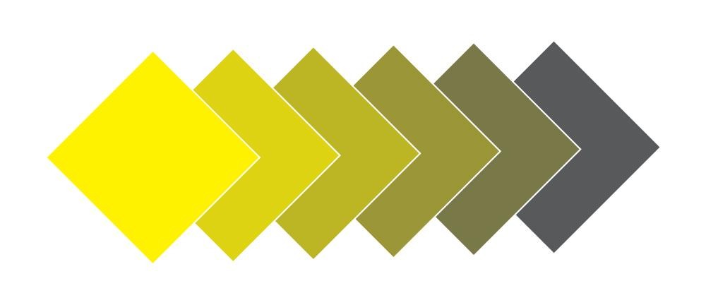
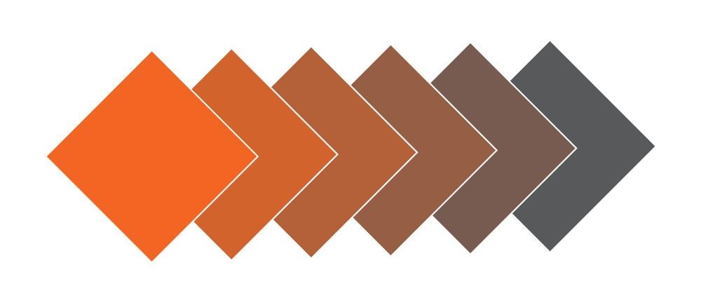
That ‘brown’ yarn in your stash? It might actually be low-saturation orange. Those ‘olive’ tones you love? They’re muted yellows. This knowledge gives you new power in designing: you can create sophisticated, earthy palettes while maintaining underlying color harmonies.
Putting Saturation to Work in Your Designs
To create excitement and drama: Use high-saturation colors, especially in warm tones like orange, red, and yellow. These naturally have higher vibrancy. Consider a scarf in saturated jewel tones – sapphire, ruby, and emerald – for a piece that makes a bold statement.
To create calm and sophistication: Choose low-saturation colors in your palette. Think dusty blues, muted greens, soft grays, and gentle taupes. A table runner in these tones will feel elegant and peaceful, perfect for a serene dining space.
To add a pop of interest: If you’re working primarily with low-saturation colors, adding just a few threads of a more saturated color can enliven the entire piece. It’s like adding a pinch of spice to a dish – a little goes a long way.
To tone down overwhelming colors: If your draft feels too energetic or chaotic, the solution isn’t necessarily to change hues – just reduce saturation. Swap that bright yellow for a tawny olive, that electric blue for a soft periwinkle.
Try It Yourself
Next time you’re planning a project, consciously consider saturation:
• What mood do you want to create?
• Should this piece whisper or shout?
• What level of energy fits the project’s purpose?
• Are you working with high-saturation colors, low-saturation colors, or a mix?
Take some yarn from your stash and arrange swatches by saturation level. You might be surprised to discover that yarns you thought were different colors are actually the same hue at different saturations. This exercise can reveal new possibilities for color combinations you’d never considered.
The Secret Language
Saturation is a secret language your cloth is already speaking. The question is: are you listening?
By understanding and intentionally controlling saturation, you move from hoping your colors will work to knowing they will. You’re no longer guessing. ou’re designing with purpose and confidence.
Whether you want your weaving to pop off the wall or whisper softly from the table, saturation gives you the power to make that choice.

Want to dive deeper into color and design? Tien Chiu’s color classes in the Handweaving Academy cover saturation, value, hue, and mood in depth, giving you the tools to design with confidence. Learn the science behind beautiful cloth, and create work that truly reflects your vision.
From the Course Catalog:
Hue and Saturation – Learn about two of the three fundamental properties of color.
Color Mixing– In this class, you’ll explore the magic of color and how it interacts in woven fabrics.