If you don’t love warping but you don’t want to weave the same thing over and over, one way to solve the problem is to weave many different projects on the same warp. You can weave nearly limitless possibilities from a single warp!
One way to change things up without changing the tie up, treadling, or threading is to play with colors. You might be surprised by how many different looks you can achieve by simply changing the color of the weft.
Choosing warp colors
When choosing warp colors for a multiple-project warp, your first priority should be compatibility. Your warp color needs to work well with all of your weft colors.
But this does not mean you’re stuck with neutral colors like white, black, or gray! You can choose brilliant colors if you do one of the following:
- Choose weft colors that mix into equally bright colors.
- Use a draft that keeps warp and weft colors separated, so they don’t mix together.
- Accept that warp and weft will mix into duller colors (this often looks just fine!)
What color to choose for warp depends on what mood you want for the cloth, and whether you want the warp or weft color to shine. The eye is attracted to bright (saturated) colors and to light colors, so if you’d rather feature the weft color, then use a darker, duller color for warp.
But if you want to feature the warp color, or if you want your project to have bright colors, then go for brilliant, saturated colors for warp! Either way will work just fine.
Choosing weft colors
Weft colors are where you get to add variety. Different weft colors can produce radically distinct looks, even on the same warp. Here are some things you can do to change the appearance of your projects, even on the same warp.
Change light/dark contrast for a bolder or subtler pattern
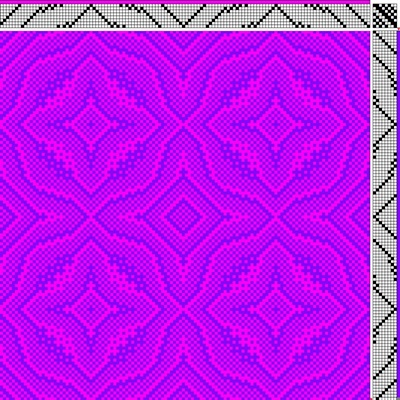
The part of your brain that sees pattern sees only in black and white. So whether your pattern is bold or subtle depends on whether there is strong value (light/dark) contrast between warp and weft. If the warp is light and the weft is dark (or vice versa), then the pattern will be bold and easily seen.
Conversely, if your warp and weft are close to each other in darkness, then the woven pattern will be subtle. This can produce very different looks on the same warp, even when the hues (color families) are the same.
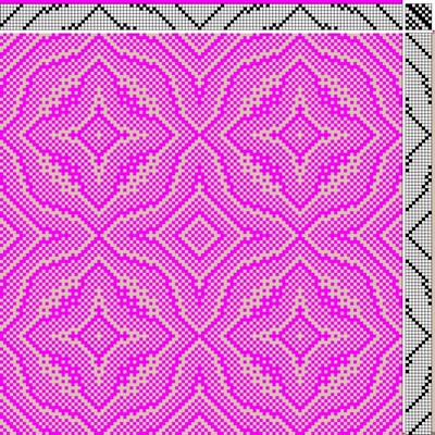
Choose a color that’s close by on the color wheel, to create a harmonious feel.
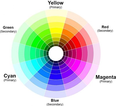
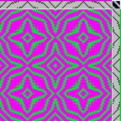
Picking a weft color that’s close by on the color wheel (within 2-3 steps) as the warp will generally create a harmonious feel. These will also likely blend into equally bright colors (unless the colors are orange and green).
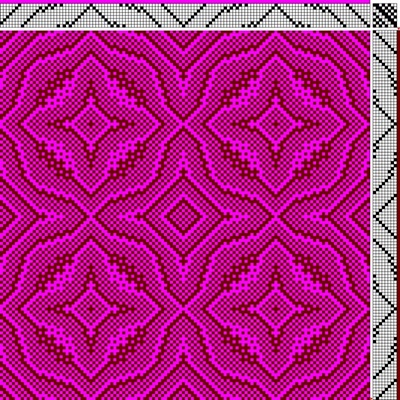
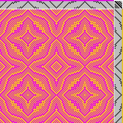
Choose a color from far away on the color wheel to create excitement and/or change the color of the cloth dramatically. (But beware of mud!)
If your draft doesn’t blend warp and weft colors much, then choosing a color that’s far away on the color wheel will create a feeling of dramatic tension in the piece. This makes the piece more visually interesting.
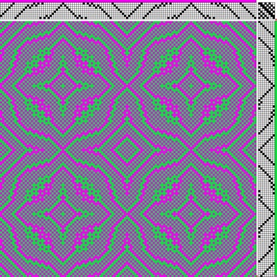
But if the draft does blend colors, then choosing a color that’s far away on the color wheel may result in a much duller color in the finished cloth. In the draft below, the green and magenta blur (especially from a distance) into a much duller color.
That may be what you want – it can tone down screaming brights – or it may not.
If you have bright colors and you want to keep them bright, use a draft that doesn’t blend the colors together, or use the colors in warp stripes to keep them separate. (More on how and why the draft is important in our Color Mixing 1 class)
If you don’t mind having the colors blend into duller colors, no problem! Forge ahead, using whatever draft you like. Don’t worry about separating the colors.
If you have your draft as a WIF file (an electronic format used with weaving software), I highly recommend the Color Editor at Handweaving.net. It allows you to do amazing wizardry with color, including seeing how the draft will weave up in your actual yarns by uploading a photo of your yarns.
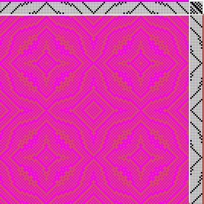
Change whether the weft is bright (saturated) or dull.
A dull color will produce a more low-key, sedate feel; a brighter, more saturated color will give a peppier mood. In the two drafts below, the warp is bright red-purple. Using a dull beige weft calms it down, while using a bright orange amps up the piece.
A process for choosing a palette
For creating lots of different looks, I’d suggest a palette with a wide range of values (light, medium, and dark yarns). A medium-dark to medium-light warp will give you the most options.
The less saturated (duller) your warp is, the more you’ll be able to change the appearance of your piece. I used a highly-saturated magenta warp in the examples above to show that you could produce very different-looking pieces even on a very bright warp, but a duller warp would have produced more dramatic shifts, color-wise.
If having the colors stay bright is important to you, I’d select a draft that doesn’t blend colors much – that creates large warp-dominant or weft-dominant areas but not areas where they mix (twill blocks are a good example). Then I’d put yarn colors from all around the color wheel – a wide variety of places – together and see what looks good to you.
Experiment with bright and dull colors as well.
That’s it! I hope this article has opened up some intriguing possibilities for you in weaving multiple pieces on the same warp, changing only the colors.
Happy weaving,

From the Course Catalog:
Color Mixing 1 – Learn about optical mixing, and how to control it in your designs
Value in Design- Learn what value is, and how to use it in your designs
Understanding Value : Color Basics – Learn to determine value accurately