Have you ever had a handwoven project turn out feeling boring – but you didn’t know how to fix it? No problem – with just one or two changes in color, you can make things more exciting.
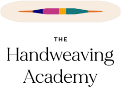
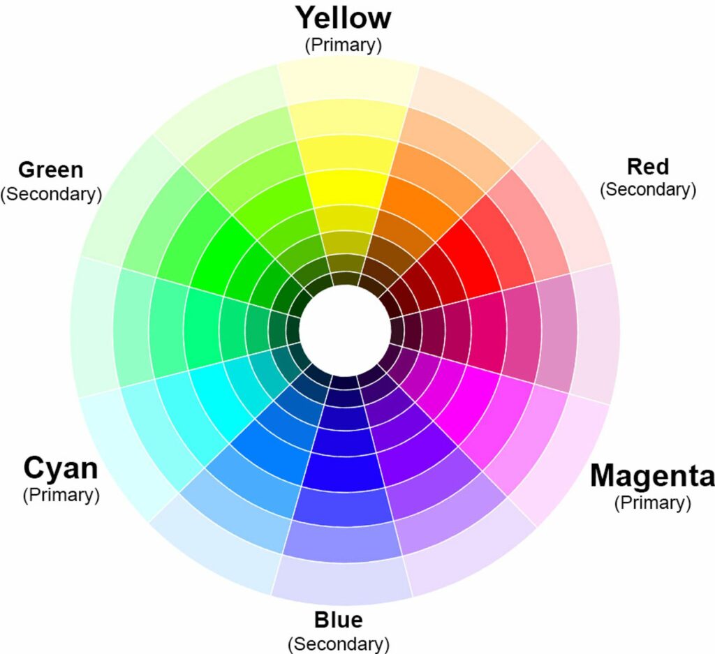
Let’s start by looking at these two pieces of cloth, both woven with the same blue weft.
The draft on the left, cyan warp and blue weft, feels subtle, with minimal drama. Its appeal lies in harmony. The draft on the right, with yellow warp and the same blue weft, has a much bolder, more dramatic pattern and a spicier combination of colors.
(Some people will prefer the fabric on the left, others the fabric on the right. That’s totally fine – this article is about making the cloth more or less exciting in feel, so you can spice up combinations that feel boring to you or tone down combinations that don’t work for you. It’s all about helping you achieve what you want!)
What’s the difference between the blue-and-cyan swatch and the blue-and-yellow swatch?
The secret is color contrast. The right side has it, the left side doesn’t.
Color as a conversation
Think of a handwoven piece as a cocktail-party conversation between colors. A conversation between very similar colors will be a calm discussion, with not much controversy. It will be a comfortable discussion – and those can be wonderful! – but won’t set off firecrackers. Your piece might feel calm and meditative to some people – but dull and blah to others.
A conversation between very different colors, on the other hand, might be like an argument between two people on opposite sides of the philosophical spectrum. Let the fireworks fly! Colors that are very different in hue or value will naturally create contrast, making a piece more exciting. And that’s exactly what’s happening in those two samples! [HA]
Value contrast
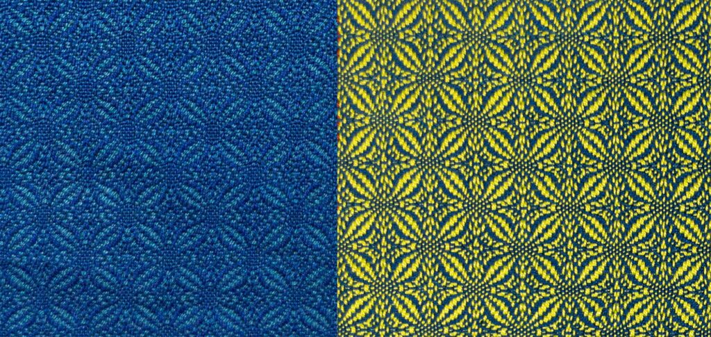
Let’s start by looking at the two samples in black and white. Value contrast (light/dark contrast) is the most important aspect of a design. That’s because the part of our brain that sees pattern and perceives depth doesn’t see color at all! It’s a primitive part of our visual system that evolved millions of years ago, before our mammalian ancestors had color vision.
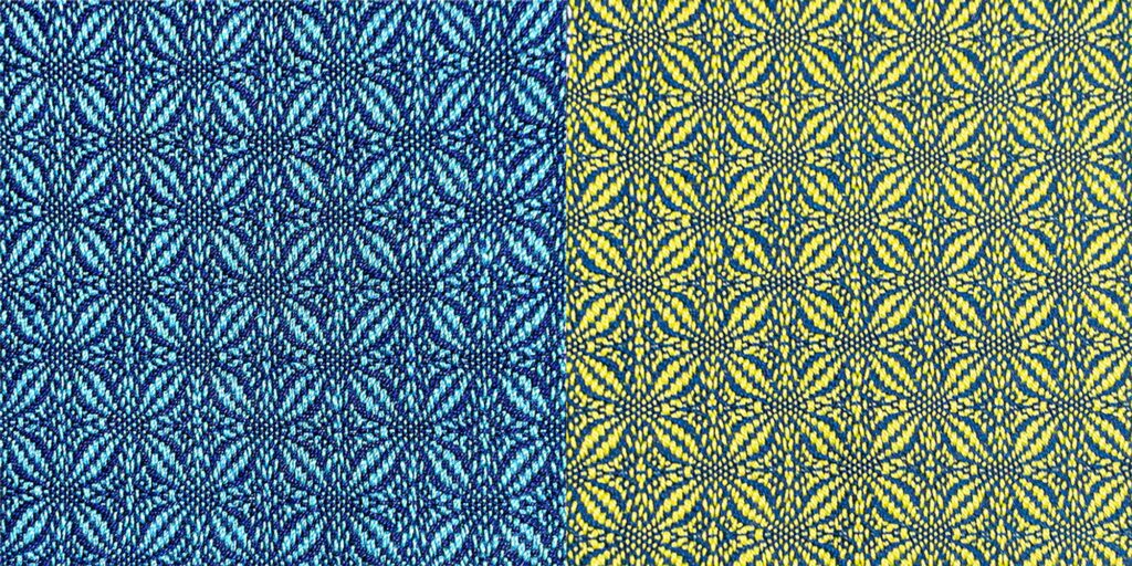
Here’s what the samples look like in black and white. The blue/cyan one is on the left, the blue/yellow one is on the right.
No wonder the blue/cyan sample looks so sedate! The blue and cyan are almost the same darkness, with very little value contrast. As a result, the pattern-perceiving part of your brain – which operates only in black and white – thinks the design is a poorly defined gray. So your brain perceives the pattern as very subtle, making that sample look less exciting. On the right, however, the yellow weft is far lighter than the blue, giving high value contrast and a pattern that feels much more exciting.
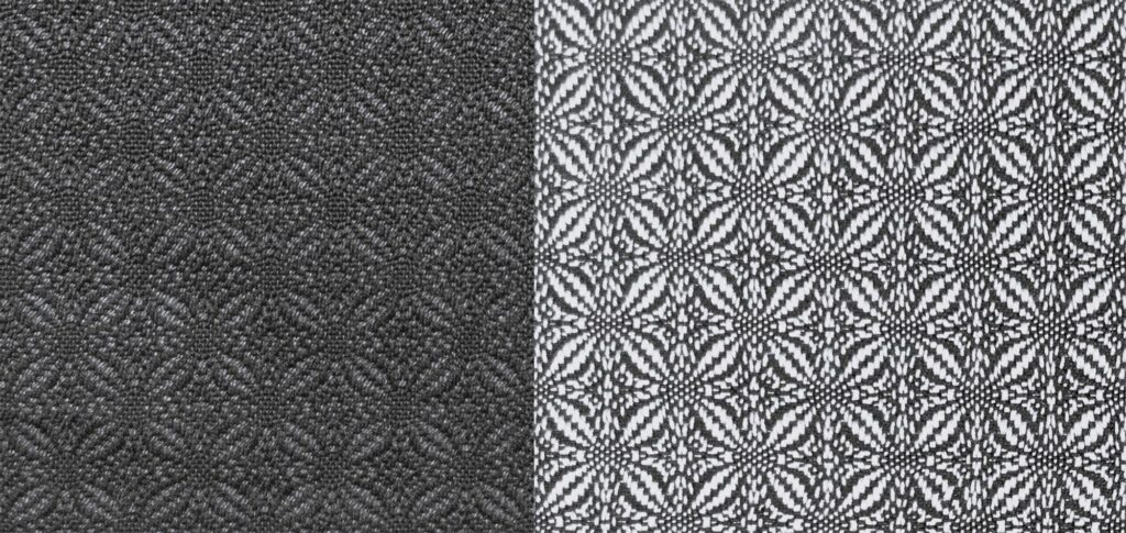
You can see value contrast (light/dark contrast) at work in the series of swatches below. They all use the same blue weft, but the value (darkness) of the cyan warp goes from dark at left to very pale, finishing up at the lightest color of all – white.
As you progress from low value contrast (both colors dark) at the left to high value contrast (one light/one dark) at right, the cloth becomes progressively more visually interesting and feels more “spicy”. The difference in “opinion” between the colors increases as the value contrast goes up, making the conversation more visually interesting.
Read more about value contrast and drama in our course Understanding Value[HA]
Hue contrast
Another kind of color contrast is important – hue contrast. The hue of a color is its color family – like red, green, blue, or purple – and hue contrast depends on where a color’s native hue sits on the color wheel.
Here’s a color wheel, which shows how the basic hues relate to each other:
The further apart two colors are around the rim of the color wheel, the stronger the hue contrast will be.
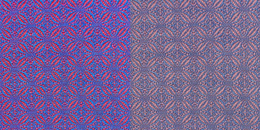
Here are two more swatches – one with a light cyan warp and another with a yellow one.
These two swatches have the same amount of value contrast, pairing a light color with a dark color. (If you look at them in black and white, they look nearly identical.)
Yet, the one on the left, with the light cyan warp, has much more spice than the one on the right (yellow warp).
In this case it is hue contrast that makes the difference. Blue and cyan are very close on the color wheel – only two steps away – so have very little hue contrast. Blue and yellow, on the other hand, are color wheel opposites – as far apart as you can get. So the blue and yellow swatch has much higher hue contrast, and the conversation between colors is much more heated.
Saturation matters
Hue contrast is affected by the saturation (intensity) of the colors. The more intense the colors, the greater the effects of hue contrast. For example, in the left-hand swatch, the colors are intense – brilliant red and sapphire blue. In the right-hand swatch, the colors are much duller and less saturated. Because of the higher saturation, the left-hand swatch feels more dramatic than the right-hand one.
So if you have ever felt a piece came out not exciting enough (or too exciting!), but weren’t sure how to fix it, now you know. Colors are like people: they have far more dramatic conversations when they have contrasting viewpoints and philosophies.
Summing up: If you want more drama in your cloth, add contrast to your colors. Start by adding value (light/dark) contrast. Then, look at hue contrast and saturation.
Of course, if your cloth is too dramatic, you can tone it down by doing the reverse: Reduce the contrast in value, hue, or saturation.
(Want to know more about how to use hue and saturation in designing your piece? We cover this – and more – in our class Hue and Saturation.[HA])
Happy weaving!

P.S. Click here to find out when new articles are published!
From the course Value in Design:
Drama – The whole skinny on the “conversation between colors” metaphor about color contrast, and how to apply it to create more interesting cloth
Value and Mood – How to create emotional tension using contrast
From the course Hue and Saturation:
Hue contrast and drama – How to create the level of drama you want, using hue contrast