Craftspeople are artists. Our work is valued for its beauty, functionality and the skill involved in its creation. Adding meaning and symbolism to that mix can create a project that’s truly special.
I try to put as much meaning into a piece as I can. A project can be almost like a name draft, but with design from the heart rather than from a code. Since we put a bit of our soul into every project, why not put symbolism in there too?
I have relied on online schools for learning structures and techniques, but none serve me better than the classes at the Handweaving Academy for creating meaning and symbolism in my pieces. I don’t learn fast, warp fast, nor weave projects quickly, so my special “signature “in my pieces is that they convey meanings and stories.
An altar cloth with heart
My minister asked for a communion table alter cloth for the Lenten season, preferably subdued to reflect the somber time up to Good Friday. I had no photo for inspiration, but I knew colors and mood. I knew symbols I wanted to put in it, so I chose Tien’s turned twill design that was published in Handwoven and then changed the heck out of it. Only the original treadling remained.
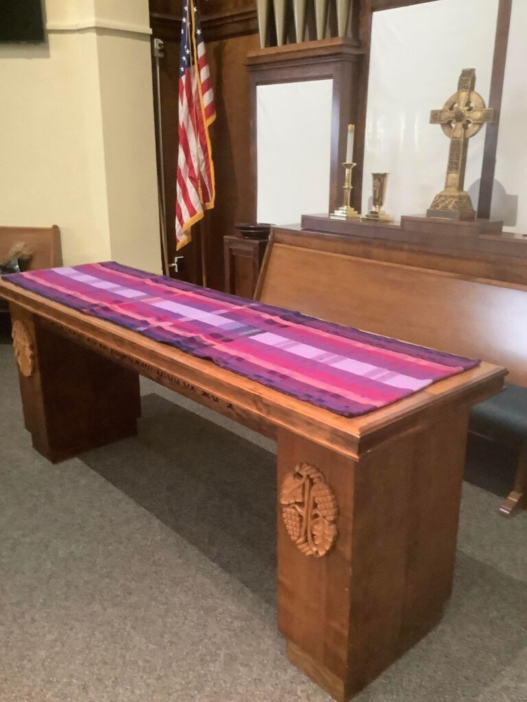
I divided it into 3 sections representing the Trinity, and 12 purples or near purples for the 12 Apostles. I added some scarlet purple for the tragedy of the Crucifixion.
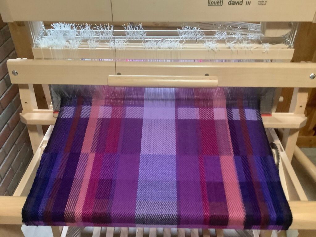
The center section had a large but subtle cross and the 2 outside sections contained lots of little crosses representing martyrdom, which happened during the early church history. We learned how to change up colors, moods, threading, treadling, sett – everything, in so many classes in the Academy.
That is how I added meaning and symbolism to my piece. Your ideas are in you, and can be expressed in your projects.
My approach to creating works with meaning
If this idea of adding symbolism and meaning to your projects appeals to you, here’s how I do it.
First, I decide to make something. I know what it is – scarf, table runner, bag, etc. I also know who the lucky recipient will be.
I may have been inspired by a flower scene or something in nature and have extracted colors to use from that photo. I might have picked a mood, too, of spring, a rainy day, or whatever.
Tien, in her Design Sessions webinars, often takes us through extracting color and mood from a photo. Her classes on color and design help us develop or enhance a mood in our pieces.
BUT – it can also just be an idea! Lent is somber with ecumenical colors of purple. It leads to the crucifixion. That’s all I needed. No photo with that project.
With colors and a project in mind, I ponder how best to show the colors and mood by picking a structure for my project and knowing how far away it will be viewed, which will affect the emotional response of the viewer. Tien’s color classes help with these choices.
A new project
I want to make my daughter a table runner, and I know her dining room is a bit busy with decorative objects. The runner will be seen up close.
Lately, Katie has been knitting pieces with handspun greys, browns and creams, which replicate a popular stone from Lake Michigan, Petoskey stones. She is delighted to be creating and selling her framed pieces. Everyone up here near Lake Michigan collects these stones!.
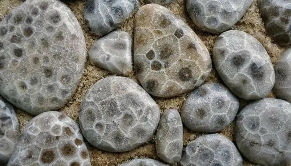
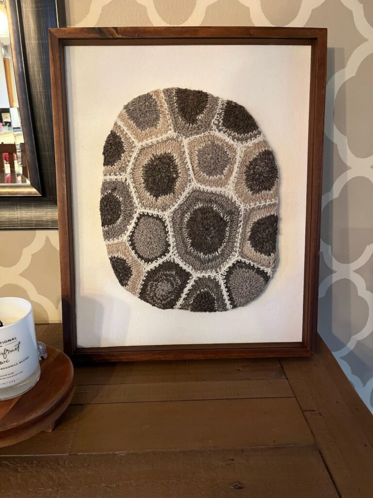
I plan to weave a runner for her using the neutral colors and simplicity of a Petoskey stone. I need it to be simple, soothing, neutral and repetitive, reflecting both the color and mood of the stone.
So now I have a project which reflects and celebrates my daughter’s creativity. Every time she looks at it she will think of her mother’s love and her joy in creating pieces of her own! I know the colors and mood. Tien’s color classes in the Academy have helped me create mood using value, color placement, weight, and drama (or lack thereof).
Tien and Janet have many structure classes which will give me a variety of choices to successfully display the colors and the mood. With their lessons on how to alter drafts by changing the colors, threading, the treadling or just about anything, I could easily pick any structure and alter it for my visual needs.
However, I am drawn to the recent Handwoven magazine’s Turned Summer and Winter Blue Horizon Tunic. I will change the colors, mood, size, and draft, to reflect the story I am telling. I never knew I could do all these changes until I took Janet and Tien’s drafting, design, and color courses and watched them demonstrate all of this in their wonderful webinars.
I know I will divide the runner into 4 subtle sections representing the 4 people in her family. There will be repetition since Petoskey stone medallions are repetitive but each is unique. The colors will be the same ones that she knits to make her pieces. See how easy and fun this is?
With injecting symbolism and meaning, you are sending a fiber message conveying just about anything you want. My altar cloth message was historical with subdued sadness. Lots of history and symbols. My runner will soothe my busy daughter but convey love and appreciation for her creative success, with a hint of those Petoskey stones.
Meaning and symbolism are in your heart, ready to be overlaid in your projects.
This blog was written and shared by Handweaving Academy member, Joy Hogg. Thank you Joy, for this thoughtful contribution to our blog.
From the Weavers Toolbox: