Zollie, a sister company to GIST Yarn, has come out with a new color product, Palette Scout. They were kind enough to send me a review copy, so I played around with it earlier this week. I love it! I think it’s very well thought-out and will be useful to anyone who wants to explore color combinations, choose palettes, or just learn about color.
What’s in Palette Scout
Palette Scout is a set of cards that come in a nice solid box, which can also be used for storing the deck. It’s got an instruction manual (which you really don’t need because it’s pretty self-explanatory), Palette Idea cards, color-swatch cards, and some “challenge” cards meant to get you started (they’re like creative prompts).
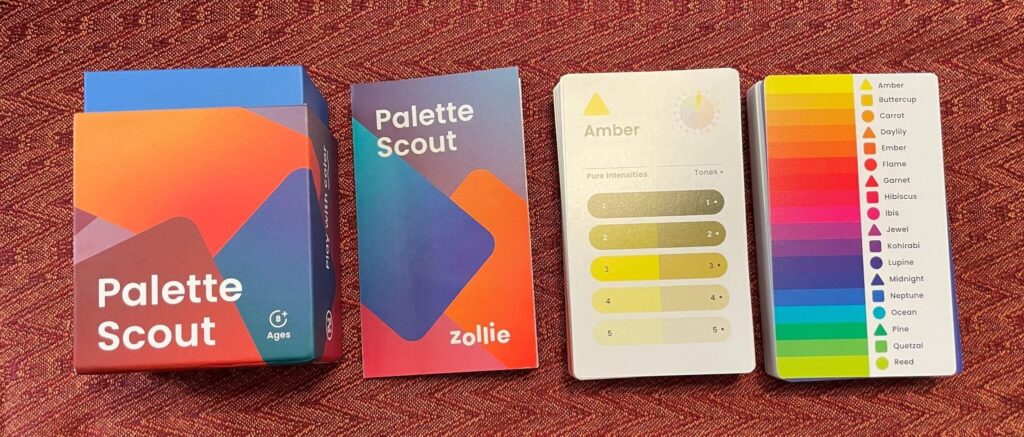
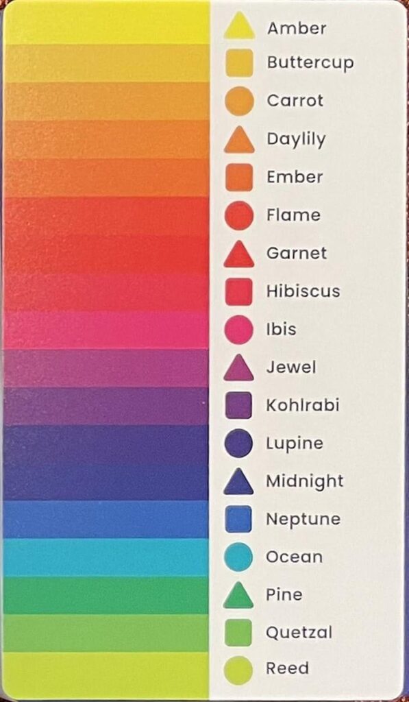
The set comes with 18 hues to explore, shown on this card.
For each hue, there’s a Palette Ideas card and five color cards.
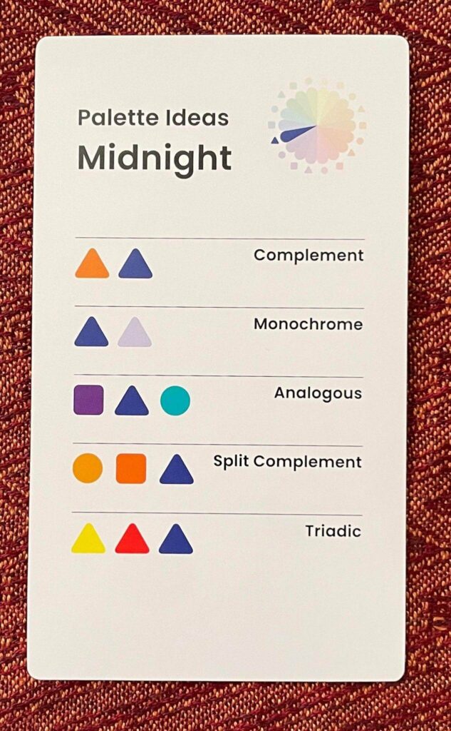
Looking at the Palette Ideas card gives you an instant overview of the many different colors in that hue:
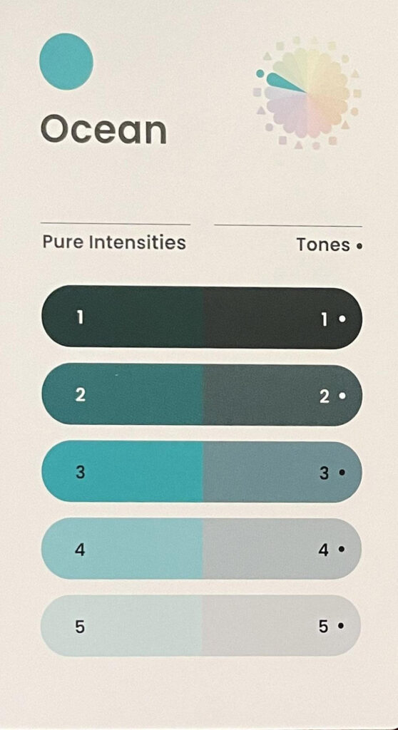
On the left are five fully saturated hues shading from dark to light. On the right are less saturated versions (“tones”) of the hue, also shading from dark to light.
The reverse side of the Palette Ideas card suggests possible hue combinations, using traditional color harmonies. (We’ll get back to that in a bit.)
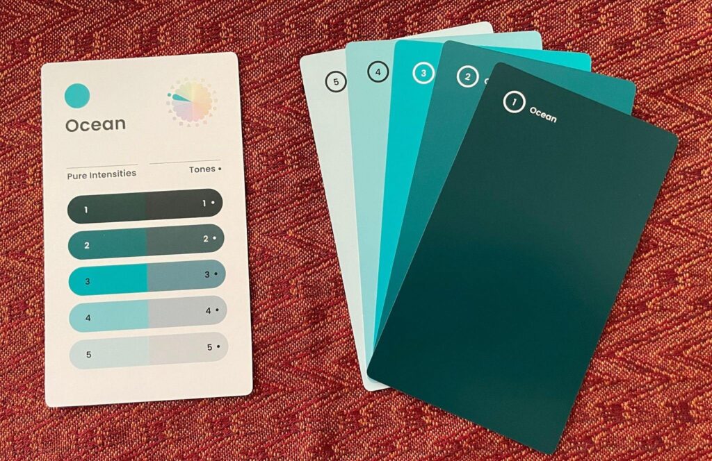
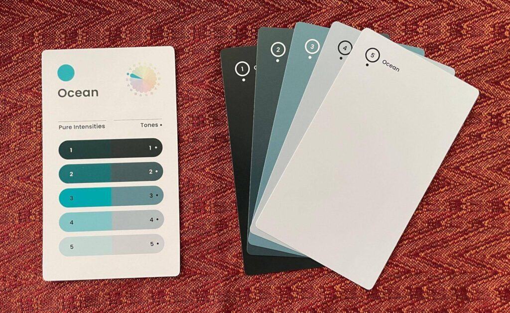
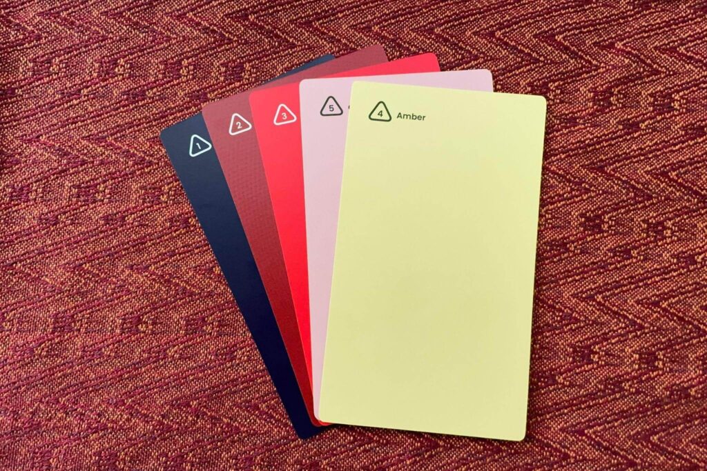
For each Palette Ideas card, there are five color-swatch cards. On the front of each color swatch card is one of the fully saturated hues. On the back of the same card is the less saturated version of the color.
Here are the front and back of the color-swatch cards for one hue.
Front (fully saturated):
Back (less saturated):
These five cards, used on either face, give you a huge collection of palette options for each hue.
Okay, so how do you use Palette Scout?
Palette Scout is great for coming up with color palettes, starting from a single hue and building the palette around that.
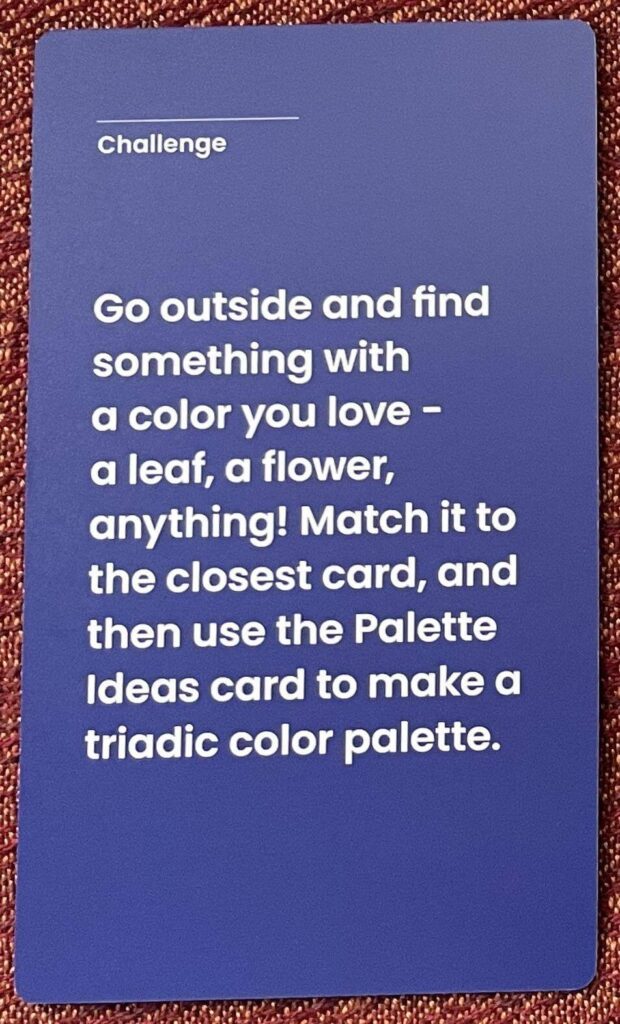
If you’re at a loss for where to start, the included Challenge cards offer suggestions.
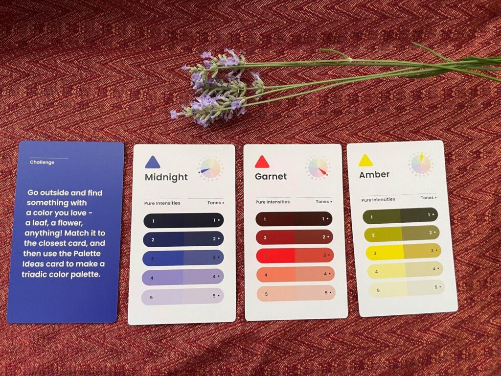
I drew one at random:
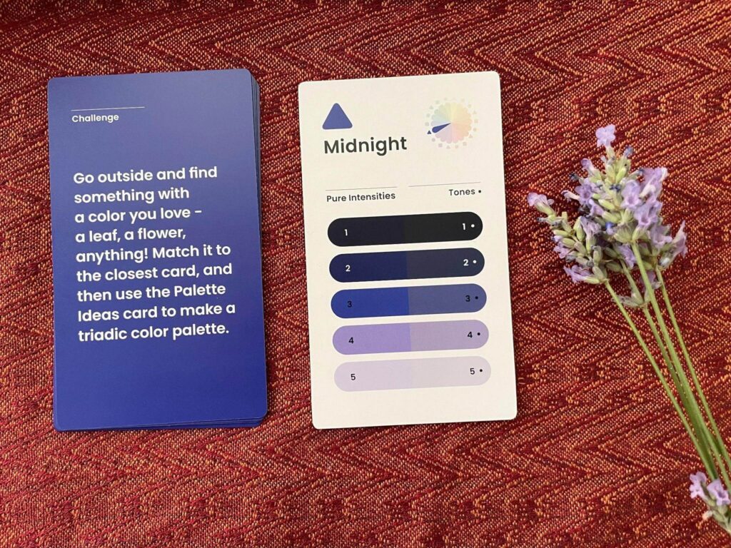
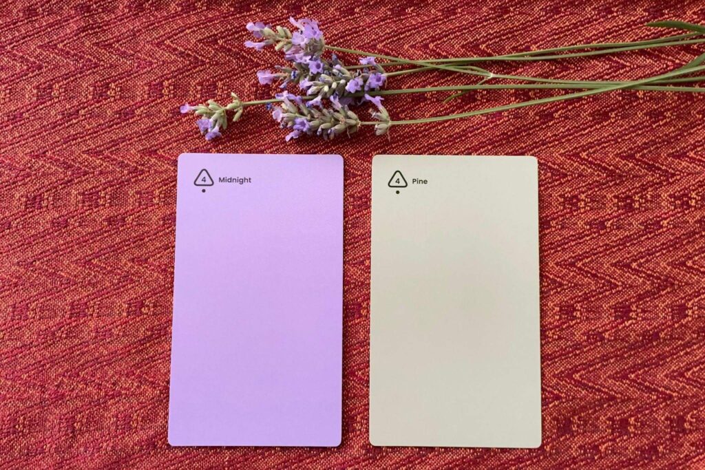
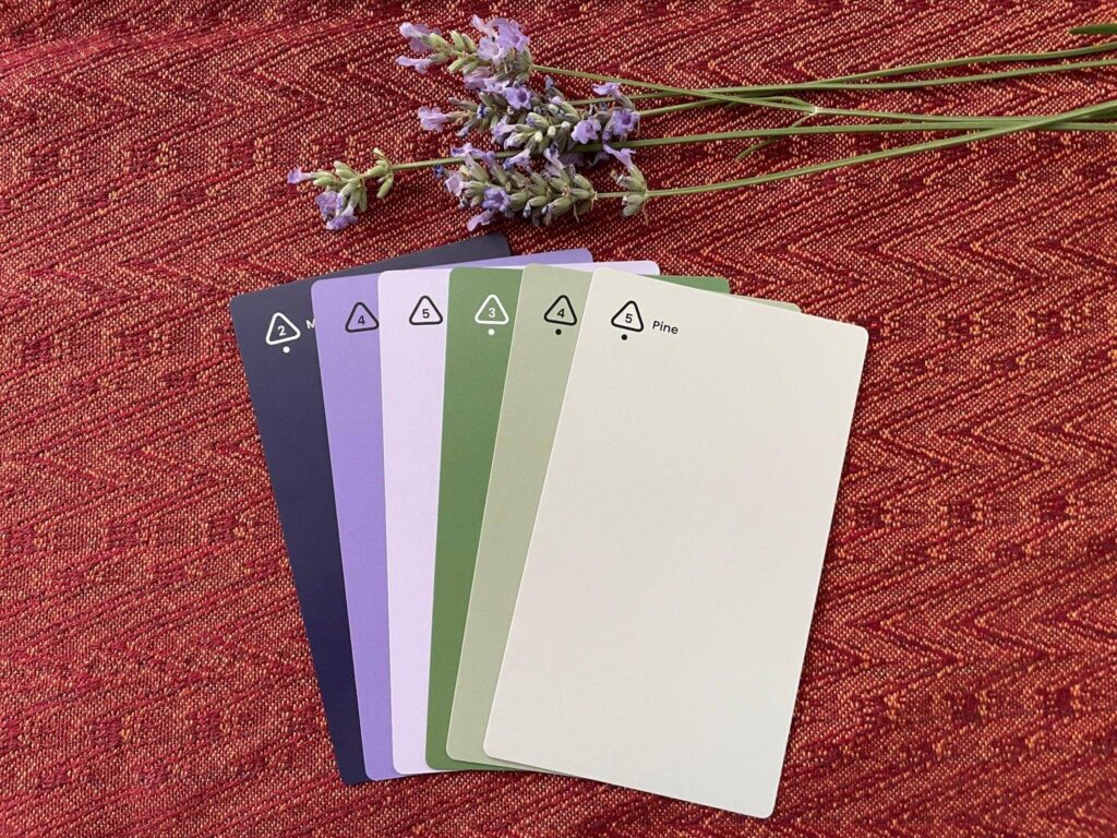
Since our lavender is blooming, I picked a spray and matched the purple flowers to the Midnight palette card:
The instructions said to create a triadic color palette using the Palette Ideas card. So I flipped over the Midnight card to show its suggested color harmonies:
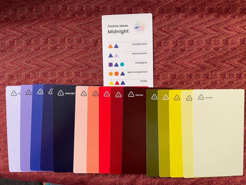
The Challenge card called for the triadic combination at the bottom, so I pulled out those Palette Ideas cards:
And I also gathered all the color swatch cards for each of those hues.
Here is the saturated side of the palette:
And the less saturated side of the palette:
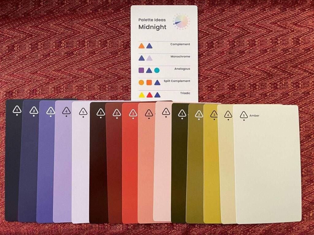
I picked five of those thirty colors as my palette:
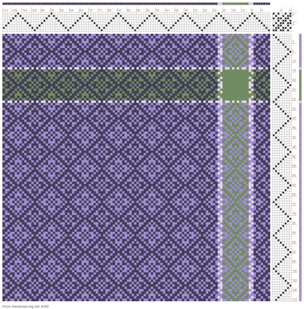
It was easy to take a photo of the cards and use Handweaving.net’s Draft Editor to pick the color palette out of the photo. I then played with colors a bit and came up with this variant of Handweaving.net’s Draft #102:
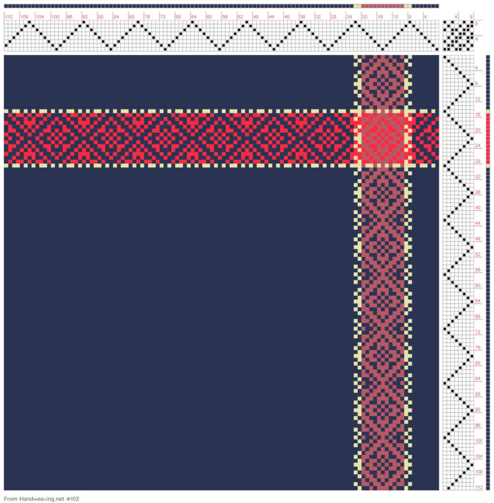
From zero ideas to palette to finished design, in less than fifteen minutes!
Another example
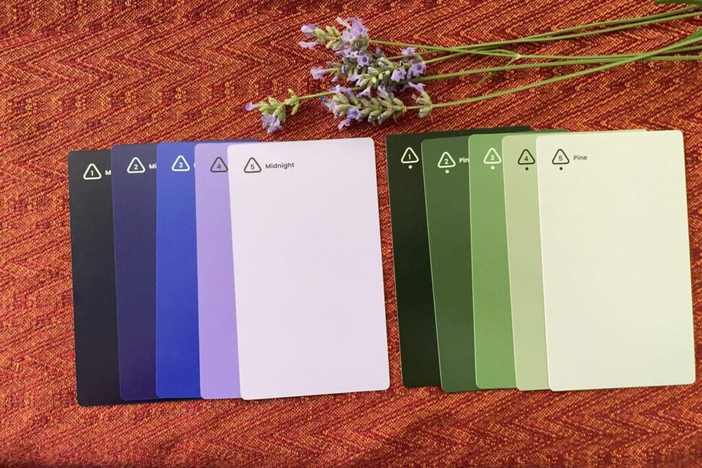
I decided I wasn’t satisfied with that palette – I really wanted something that matched my lavender blossoms. So I rummaged through the deck until I found the best color matches for my flowers:
I then picked out all the color swatch cards for the two hues to create a large color palette. (I haven’t shown the reverse sides of the cards, so keep in mind that there are really 20 colors in this palette, not 10.)
From those I selected a smaller collection of colors to play with:
Finally, I uploaded the photo of the cards into Handweaving.net’s Draft Editor, and created a different design. This one reminds me of my lavender blossoms, and I love it!
Some caveats
Color mixing in weaving often produces colors that aren’t in the original yarn palette. So while the palette combinations are great starting-points, keep in mind that the woven cloth may look different.
The other challenge with any color palette often isn’t designing in that palette, but finding the colors in the yarn you want to use! So while the palette is extensive, before you commit to designing something with it, make sure you can get the colors you’ve chosen.
Even though you may not be able to find all the colors, the cards can be super useful in giving you ideas for possible color combinations. Just match the yarn you’ve got to the nearest color in the palette and use the Palette Ideas card to come up with hue combinations that might work. In just one Ideas card you get five different hue combinations to try! Match some of those hues to yarns in your stash or in the yarn shop and go go go.
Two thumbs up
I don’t normally rhapsodize about color tools, but this one is exceptionally well designed and easy to use. So if you’re interested in learning about color palettes or designing with color, get Palette Scout and give it a try!

From the Course Catalog:
Understanding Value – Color Basics – Learn how to accurately determine value, and use it to enhance your designs
Hue and Saturation – Learn to create a palette of color that harmonizes, and suits your personal taste.