Sometimes creating handwoven fabrics feels like wrestling mischievous imps. A project that looks gorgeous in the initial sketch, or in a weaving software simulation, turns into a muddy mess when woven. A garment that looked great while you were sewing it blurs into shapelessness from across the room. Figuring out what happened can feel hopeless.
Many times, though, the problem is pretty simple: You’ve designed at the wrong scale. Your design is either too large or too small to look attractive when a viewer looks at the finished piece. So your colors blur together or become too bold, and your piece just doesn’t look right. And, if you viewed your sketches or draft the way most people do – close up – you probably didn’t notice there was a problem, because you were seeing the design at the incorrect size.
Here’s how to design a piece at the right scale, whether it’s meant to be seen from six inches or sixty feet away.
Scale determines what you see
The scale of a design controls how you see it. If a pattern is so small the eye has trouble perceiving it, the colors in the pattern will look like a single color. This effect is called optical mixing, and you can read all about it in the Color Mixing I class – Join the Academy for access to ALL our classes!
The Impressionists applied optical mixing beautifully in their paintings. Claude Monet’s painting Haystacks (Sunset) appears to use solid, or near-solid colors at a distance:
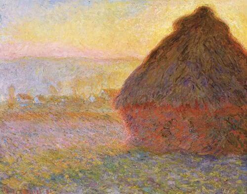
But when viewed close up, the apparently solid colors show themselves to be many tiny dots of color. Here is a close-up taken near the bottom left corner of the haystack.
Whether you see many small splotches of color or a landscape painting depends on how close you are standing. This painting looks radically different when the viewing distance (and thus the scale of the dots) changes.
Viewing distance affects scale
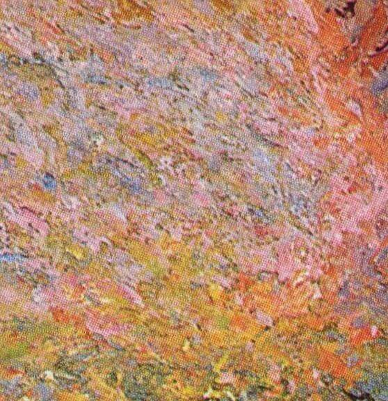
You can see a similar effect in these handwoven lavender sachets. These are woven using 60/2 silk as warp and rayon machine embroidery thread as weft.
From a distance of several feet, each of the sachets appears to be a solid color with a design of diagonal squares:

But at a distance of a few inches, you can see the different colors interlacing in plain weave.

Designs that look good close up, where detail is readily perceived, often blur at a distance. Conversely, large-scale designs may look good at a distance, but seem overwhelming or garish when viewed nearby.
Yarn size changes the scale of your design
Yarn size plays a large factor in the size of a handwoven fabric design. Fine yarns will produce a smaller, more subtle design than thick yarns when woven using the same draft and colors.
For example the photo below shows two pieces of fabric, woven using the same draft. The image shows the swatches as they appear from three feet away. The top swatch is woven in 120/2 silk (30,000 yards per pound/15,000 m/g) in both warp and weft. The bottom swatch uses much thicker yarns, about 2,500 yards per pound/1,250 m/g.
The sample woven in fine yarns looks delicate and intricate; the sample in thick yarns looks bold, almost overwhelming.
However, when viewed from 10-15 feet away, the designs look quite different.
When you look at the same fabrics from a great distance, optical mixing has blurred the black and white design into a nearly solid gray. In the bottom sample, however, the red and black patches of color remain distinct, the pattern shows clearly, and the cloth looks great.
View your designs at their finished scale
Because scale has such a profound impact on color and design, it’s important to check your drafts at the right scale when designing handwoven cloth. For example, napkins are typically viewed from 2-3 feet away, either on the table while sitting down, or in your lap while eating. So when evaluating a draft for napkins, you’ll want to view the draft as the finished napkin would appear from three feet away. But when evaluating a wall hanging, you’ll want to consider how it looks from across the room.
One common mistake is to look at drafts at a size that makes it easy to “read” the threading and treadling, but which is larger than the finished fabric. While it is easier to design drafts close up, you’ll need to scale down to the size of your finished piece, at the distance from which people will see it.
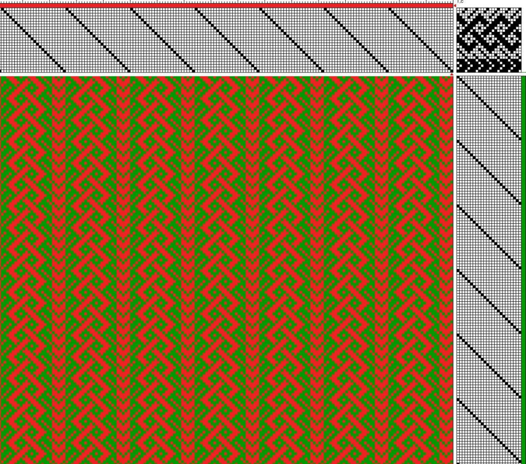
For example, below is the draft used in the previous samples. The treadling, threading, and tie-up are clearly visible, making it a good scale for editing.

However, as we’ve seen, the finished fabric can look very different depending on the yarns and viewing distance. For the sample in finer yarns, viewed at three feet away, evaluating the design at the much smaller scale below would be more appropriate:
And of course, if viewed from further away, the draft would need to be scaled down even further.
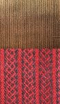
Evaluating the draft at the correct viewing size becomes even more critical when envisioning color combinations. For example, below is the same draft, in red and green, at a large scale.
At this scale, the red and green yarns appear visually distinct, and the piece is bright and energetic.
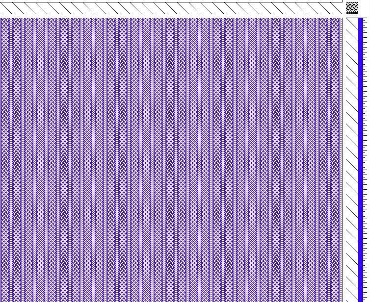
However, when viewed at a smaller scale, as the draft would look if woven in fine threads or seen from further away, the draft looks like the one below:

Now the brilliant red and green have blended to brown!
To avoid unexpected color mixes, make sure you preview your design at the correct scale before warping your loom. Weaving software such as our Draft Editor makes this easy, but if you don’t have software, you can take a photo or screenshot of your design, then zoom in and out while viewing your photo to enlarge or reduce the design.
Summary
- How good a handwoven project looks depends on the size of the design when viewed. As the piece gets further from the viewer, the design appears progressively smaller in scale. So consider viewing distance when designing.
- If the design appears small enough, optical mixing will blur the colors into a single shade. Patterns that appear bold close up may blend into mud.
- Because scale is so important, evaluate your designs at the size they will be in real life, at the planned viewing distance.
Happy weaving!