Welcome back to the Design With Me blog series!
In Part 1, I selected colors and dyed my painted warp.
In Part 2, I put the warp chains in order and beamed the warp, explaining my special method for warping without a cross and for getting out tangles.
Today I’m excited about choosing a draft and getting the warp threaded. Then I can start weaving!
Finding a draft: Handweaving.net
Sometimes when I am designing a project, I start with a particular draft in mind, or at least a particular TYPE of draft. Something like “A classic looking overshot”, or something in twill, with a strong pattern.
Not this time!
For this project, I didn’t have any real plan for the draft. I had my inspiration photos that I shared last week, but I wasn’t sure that I wanted to go with “Stars” or “Undulating”, which were my first thoughts based on those photos.
So, I decided to keep an open mind and I headed over to Handweaving.net, which has over 75,000 drafts to select from. You need an (inexpensive) subscription to view or download the full drafts, but you can view the drawdowns without a subscription.
To avoid surfing drafts for the next 4 months (unless you WANT to do that!), it is a great idea to narrow down your search a little. The easiest way to do this is to limit your search to drafts that you can weave on YOUR loom.
So sign in to Handweaving.net and click “Drafts” in the top toolbar.

From there, click on Search Drafts, then choose how you want to search:


In this case (as I often do) I chose Newest Drafts, but feel free to pick any of the options available to you.
Once I get to the actual drafts, I filter them based on the number of shafts and treadles, and the length of float that I would like to end up with. This is a great way to narrow your options down to things that are appropriate for whatever it is you are designing.
Now you are free to scroll away, and see what catches your eye!
PRO TIP: I use the clipboard on Handweaving.net to save random drafts that look interesting, but if I am looking for a particular project, I will save screenshots of drafts in a digital folder, including the draft number so I can find it later. This means that anytime I want, I can open the folder and quickly compare the drafts that I thought might work. I don’t think too much about the drafts I’m selecting – I just drop in any draft that catches my eye. I can always delete the ones that I don’t like, later.
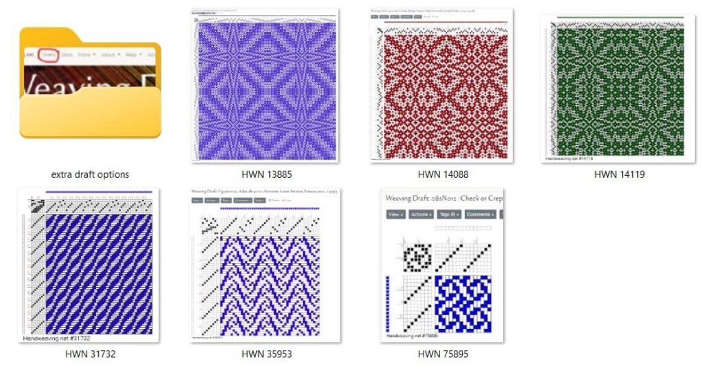
Here is what my folder for this project looked like, after browsing through drafts for a while:
I want to highlight the warp, as it has so many colours in it. When I design, I think of a few things and how they play together.
- Warp colour – is it the star of the show, or is it a “backup singer” for the woven pattern?
- Weft colour – Same as above
- Weave – Do I want the weave to be highly visible, or is it providing a backdrop for the warp and weft colours?
For this project, I love my Snow-Dyed Warp so much that I want to highlight the colours of it. This means that I will choose a weft that doesn’t distract from the warp colours. I am considering a monochrome hand-dyed weft, but will likely end up choosing a solid weft for this one.
Here are my thoughts on each of these drafts:

This draft (14088) is very “busy” looking. I like that it looks like exploding stars. I put the pattern clarity at “medium” as it doesn’t have large areas of warp or weft showing. This puts it in the maybe category.

This draft (14119) is pretty similar, although the star shapes look slightly more defined. I will leave it in the maybe category as well.

This draft (13885) has a stronger pattern. The proportions of warp-dominant, weft- dominant, and plain weave areas are similar to the other star drafts, but the overall areas are larger, which will make the pattern show more. This puts it in the “high maybe” category.
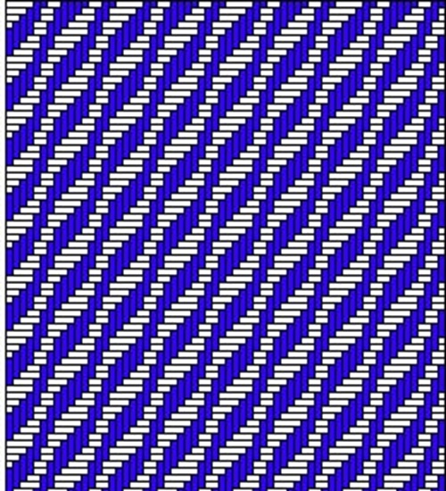
This undulating twill draft (31732) is a much stronger pattern when you look at it in the image to the left, but the threading repeat is only 16 ends, so it is on a smaller scale. I worry that this will make the pattern all but disappear, unless you are looking at the fabric from VERY close up. Into the maybe pile it goes.

This draft (35953) really caught my eye, as I think it looks a LOT like waves/water. I also like that the waves seem to be a little unfocused at certain points. The pattern is relatively strong, with large areas of weft showing. This isn’t ideal for my plan to showcase the warp, but the “back” of the fabric will be the opposite, with mostly warp showing. This would be fine, if it was something that I wanted for this fabirc, but I don’t necessarily distinctly different looks on the front and back, as it is reasonable that both sides of a shawl/scarf will show at the same time. This one goes into the “interesting, but not for this project” category.

This draft (75895) make me think of space and shooting stars. The pattern strength is in the medium range, with relatively equal parts warp/weft showing. The scale is an issue though, as the threading repeat is 8 ends, which will translate into roughly ⅓” in the finished piece. This is too small for what I want, so I am putting this one in the “not for this project” category.
None of the drafts I had found were really “hitting the spot” for this warp, so I kept looking.
My next stop was my draft books. I flipped through a few of my favourites: The Handweavers Pattern Directory by Ann Dixon, A Handweavers Pattern Book by Marguerite Davison (aka “the green book”), and Carol Strickler’s A Weaver’s Book of 8-shaft Patterns. .
I “filtered” my options by skipping the sections on lace, colour and weave, repp weave and overshot, as I knew that I did not want to use any of those.
When I saw this draft in the Strickler book, I actually gasped out loud!
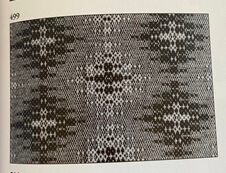
I REALLY liked this one. It has a strong pattern, with relatively large areas of warp and weft dominance. It also has large areas of plain weave, which will blend the colours of the warp and weft. I also liked that it looks like outer space, if you think of those motifs as shining stars.
The threading repeat is pretty large at 122 ends, which would give me the larger scale that I wanted. That will add some drama to this piece.
Now that the draft was decided, I got my notes in order and started threading.
Here’s what I do to keep track of my threading, in case of interruptions:
First, I write out the threading. I prefer to write the numbers of the shafts, in groups of 3-5, and I use painters tape to attach the paper to the high castle of my loom. When I stop for any reason, I put a flower head pin through the paper, marking the last end that I threaded, like this:

Once threading was complete, I sleyed the reed. I have the centre of my beater marked in pencil, making it easy to lay a tape measure down. I measure half the width of the warp in order to find the spot where I should start sleying.
While I sleyed the reed, I kept an eye on the heddles and threads, to make sure that I was sleying the correct number of ends, and that the threads I was sleying were in the correct order, with no tangles or threads crossed between the heddles.
After I finished sleying, I tied the warp on and tied up the treadles.
PRO TIP: Once the tie-up is complete, press each treadle in order, and confirm that the treadles are lifting/lowering the correct shafts.
I then chose a bobbin that had some leftover yarn on it, that was approximately the size I wanted for weft, but in a colour that contrasted strongly with the warp.
Using this high contrast yarnI wove a small amount of plain weave. This allowed the warp to settle in, and I could check for sleying and threading errors (this draft had a threading that alternates even/odd shafts, so most errors will show up in plain weave). I found one sleying error, and a couple of threading errors and fixed them up.
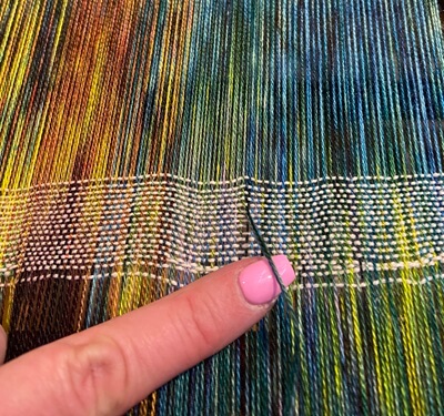
I then wove a partial repeat of the pattern to see if any other errors stood out. All was well, so I went on to choosing weft colours for sampling.
I didn’t have any firm ideas about what colour of weft I wanted, and I had a vague idea that a monochrome tonal weft might be interesting, so I started grabbing yarns that might be appropriate, in a variety of colours.
I specifically wanted some light and dark colours, and I tossed in a few hand dyed skeins that I thought might be nice as well. I didn’t want to wind the hand dyed skeins into balls in order to use a small amount for weft sampling, so I chose some yarns that had similar colours.
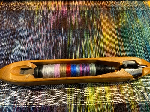
Here are the dyed skeins, and the cones/spools that I chose for weft sampling, from right to left:
- Light sage green (similar to the lights colour in the left hand skein)
- Black, purple and blue variegatedl, magenta (that is in the middle skein)
- Grey-blue (again, similar to a colour in the left hand skein)
- Royal blue
- Deep red
- Beige,
- Lavender (similar to the colours in the skein on the left)
- Light grey/silver.
I have a pact with myself that when I sample wefts, I will always add at least one colour that I do NOT think will work, just to see what will happen. This time, it was the beige.

I then grabbed a pirn for my favourite AVL end feed shuttle, wound a little bit of each of the colours that I wanted to sample onto it, and started weaving.
I wove ¾-1” of a colour, then snipped the yarn, and pulled whatever was left of that colour off the pirn, then continued with the next colour.
Here is the what it looks like so far:
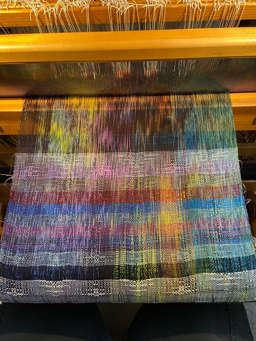
There are some tension issues in the warp at this point, but right now, I am interested in the weft colours. The tension will be fixed before I start weaving “for real”.
I noticed a few things:
- The black weft keeps the warp colours as they are, but the weave is almost invisible. This might be a little different when certain parts of the draft line up with the lighter colours in the warp.
- The variegated weft is interesting, but it overtook the warp colours in the sample, and the weave wasn’t very visible.
- The light colours showed the weave clearly where they crossed dark warp thread, but the dark colours did not do this where they crossed the lighter warp colours.(Why this happens is something that I will have to think about for a while.)
- The light sage green (above the black) allowed the weave to show, and the warp showed through a little more than the other light wefts. This was also true of the grey-blue and the beige. (When I used a filter to look at the weft options in black and white, it was apparent that these colours were of medium value, which explains this)
Next week, I will choose the weft, cut these weft samples from the warp, weave the scarf, and get to the finishing.