In the past three weeks, you have joined me while I designed a project that would highlight my favourite (so far) snow dyed warp.
We have talked about how I chose the colours, and dyed the warp in Part 1, some of the tricks I use when beaming a warp like this in Part 2, and in Part 3, we discussed choosing a draft, and we sampled some weft colours.
Now we get to the FUN PART!!
This week, come along for the ride while I choose my weft colour(s!), analyse the fabric as I weave it, and tell you my overall impressions of the finished fabrics.
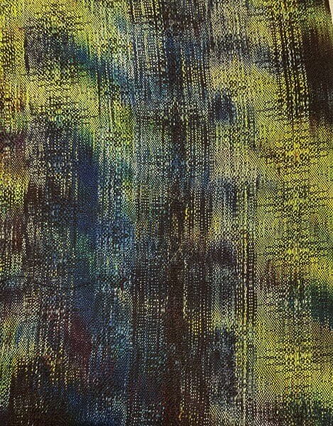
Last week, after I finished the weft sampling, I took some photos, and went off to do other things for a little while. I then went back to the studio, looked at the samples and the photos, and decided that I quite liked the grey-blue (shown here, just below the royal blue sample).
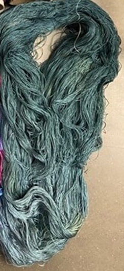
I chose this colour to use in my weft sampling as it was the lightest colour in this hand dyed skein that I had on hand.
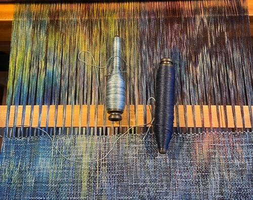
I balled the skein up, and filled four pirns, which experience tells me is pretty close to the amount of weft I need for this type of project.
I wrote out my treadling order, and I started weaving.
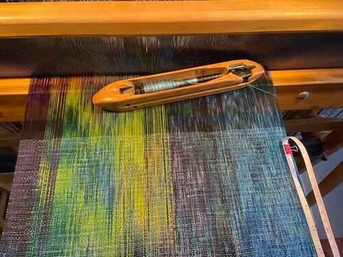
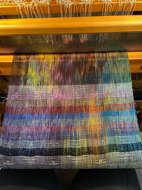
As I wove, I noticed how the mainly medium tones of the weft were lightening the overall look of the warp, but the pattern stood out nicely anywhere where the warp was dark. I really like this look, and I was especially pleased with the parts of the warp that were blue toned. The striations created by the tonal nature of the weft made them look like water, which was an unexpected, but very welcome result.
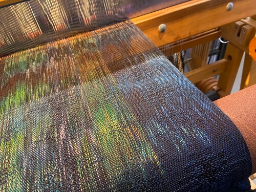
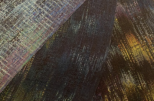
While I was weaving this first piece on the warp, I realized that the tones of the weft I was using matched some portions of the warp quite closely. This made me wonder how it would look if I used a dark colour, that wasn’t quite as intense as the black that I used in the weft samples.
I poked around my studio, and found a partial spool of a lovely navy tencel. I think you will agree that it looks quite nice with the warp!
I didn’t have much of the navy available, so I decided that I would weave it all and hope that I had enough to make a cowl, or some other small item.
I was really happy with how the navy played with the colours of the warp, and was left wishing that I had more of it. The dark sections of the warp really highlighted the texture of the weave using the navy.
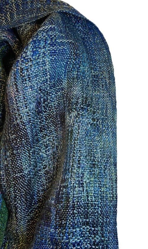
When I ran out of the navy weft, I wasn’t quite ready to give up the moody feel of the dark weft. I didn’t love the black weft when I did my weft sampling, but I was ready to give it another chance, so I wound some pirns, and kept weaving.
The black weft was a little more stark looking than the navy, but I really liked how the pattern showed on the different values of the warp, even though the pattern all but disappeared in the areas of the warp that were very dark.
Once I had woven the entire warp, I took it off the loom, wet finished it, and sat back to look at what I had created, two scarf lengths, and one cowl length of lovely drapey fabric.
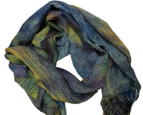
The light weft has lovely variations of colour and the striations from the tonal weft gives it less visual weight than the other pieces. I like the overall look of this piece, but I will definitely keep in mind that if the warp and weft both have a large range of value within them, the finished fabric could look very busy. In this case the tonal nature of the weft gives the finished fabric a bit of a distressed look, which I am quite happy with.
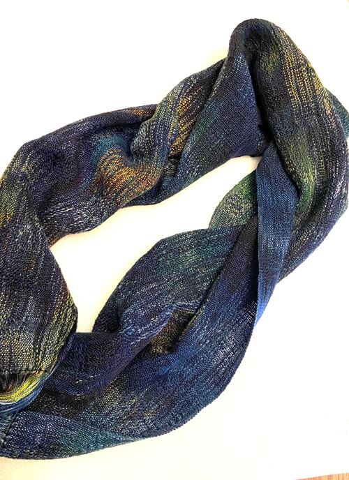
The navy piece has a really lovely visual weight to it. It definitely skews the overall warp colours to the blue side of things, but I don’t mind that one bit. This piece feels moody and sophisticated, and I am excited to make it into a cowl that I anticipate I will wear a lot in the fall, with both my black leather jacket, and my jean jacket.
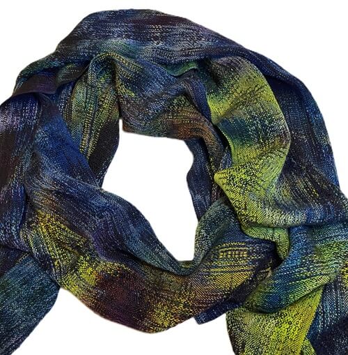
The black piece, which I worried would be a little stark looking, definitely made the warp colours the star of the show. I really enjoy how when it is wrapped up as if it was being worn, the texture of the pattern is apparent in several ways. It sometimes shyly peeks out of a darker areas, with the shine of the yarns giving you the hint of something more intricate than plain weave, and in the areas where the warp is light, the pattern holds hands with the warp colour, and they walk along like old friends.
Overall, I am extremely happy with all three pieces, even though they have their own distinct looks.
Which weft is YOUR favourite?
Thank you for joining me in my adventure with a snow dyed warp! I hope you enjoyed our journey, and maybe even picked up a trick or two for your next design project!

PS: If this blog series has you interested in working with hand dyed warps, the Handweaving Academy has classes that will have you creating with confidence!
Dyeing Painted Warps – Demystifying the process, so you can create your own unique warps.
Designing with Painted Warps- Learn how to design effectively with painted warps, and create your beautiful painted warp into a project that you love.