Handpainted knitting yarns are SO tempting. You go to a yarn shop or knitting conference, and walls of luscious handpainted yarns leap out at you. Next thing you know, you’re clutching a receipt and bag full of gorgeous, colorful painted skeins.
Can you weave with handpainted yarns? And WHAT can you weave with them?
The bad news is that hand-painted knitting yarns, understandably, are generally designed for knitters, not weavers. As a result, the bright colors in a knitting yarn often weave up into dull colors when woven together, even if they look great in a knitted project.
The good news is that you can work around this, to create beautiful projects using your hand-painted yarns.
In this article, I’ll explain why mud often happens, and two ways to fix things.
Problem 1: Hand-dyed skeins look different in the skein
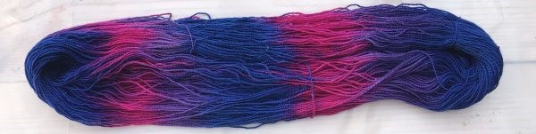
Here’s the first problem. Hand-dyed skeins often turn up in the shop just as they were dyed, with the colors all neatly lined up in the skein in big chunks of color:
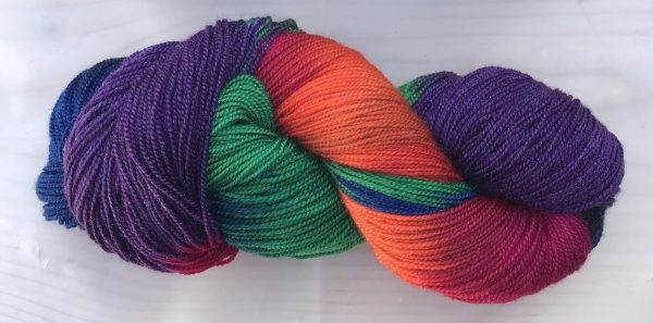
These colors are beautiful, but they don’t resemble the colors that appear once the skein is wound into a ball, or knitted/woven.
Fortunately, many dyers rewind their skeins to give you a better idea of how the colors will mix in practice. This dyer has rewound the skein to give you a more realistic view:
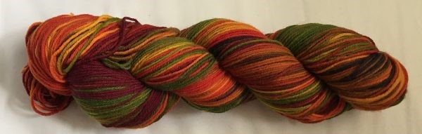
This skein doesn’t look as appealing as the first skein, but it gives a much more accurate idea of how the colors will blend once woven up into a finished piece.
Because of this, when shopping for hand-dyed yarns, it’s better to look for yarns that have been re-skeined after dyeing. It makes it easier to understand what the colors will look like once you’ve woven up the piece. (The one exception is if you’re planning to weave “faux ikat” with the yarn, lining up the color changes while warping with the yarn. More on that in a little bit.)
Problem 2: Knitting is not like weaving
Even if the yarn has been re-skeined after dyeing, your woven piece will not look like the knitted swatch hanging up next to the yarn. That’s because knitting blends colors very differently than weaving.
Color blending in knitting
Knitting produces individual stitches that are rectangular blocks of solid color, with sides about 3 times the thickness of the yarn. These blocks appear in sequential order, so if you have a long run of a single color, it creates a broad stripe of color 3x the thickness of the yarn.
Which means that this skein of yarn, when knit up, can look like this:
Color blending in weaving
Weaving works very differently. Weaving produces much thinner stripes of color, only one thread thickness wide. As a result, the painted-yarn colors blend together much more in weaving than knitting.
Weaving also blends warp and weft colors, so the warp color needs to be taken into account.
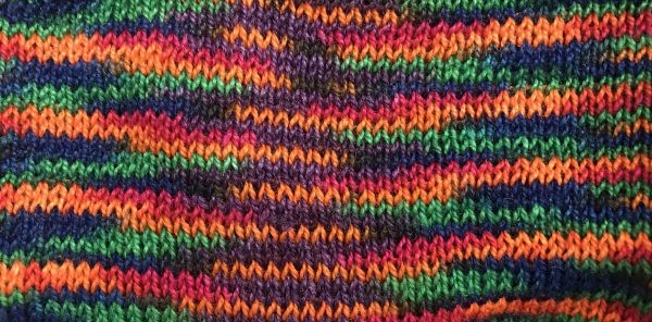
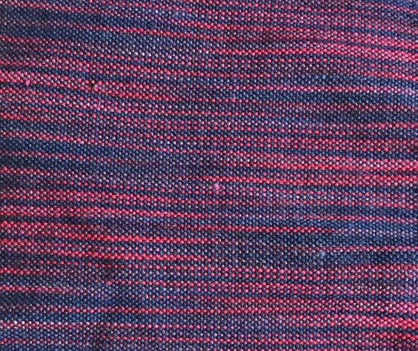
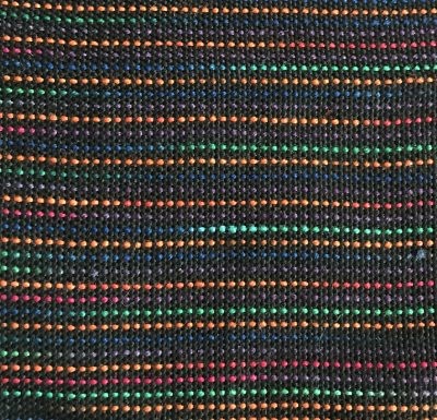
Here’s a woven swatch using a black warp and the painted yarn as weft:
You can see that, while the colors remain bright in the knitted swatch, they are much duller in the woven swatch! That’s because the colors in the woven swatch mix together much more, while the colors in the knitted swatch are in bigger patches and so stay distinct to the eye.
If you like this effect, no problem! Carry on.
But if you bought the skein because you liked the bright colors and you want them to stay bright, then you have two options.
Solution One: Choose colors that mix into equally bright colors
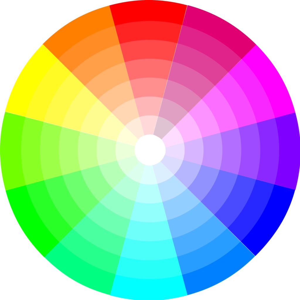
The first option is to limit yourself to skeins composed of colors that mix into similarly bright colors. Colors that are within two steps (60 degrees) of each other on the color wheel will mix into colors that are almost equally bright.
Colors 3-4 steps (60-120 degrees) away from each other will become duller.
Colors that are more than 4 steps (120 degrees) apart from each other on the color wheel will mix into much duller colors.
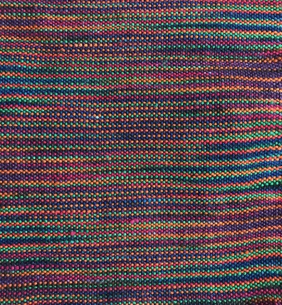
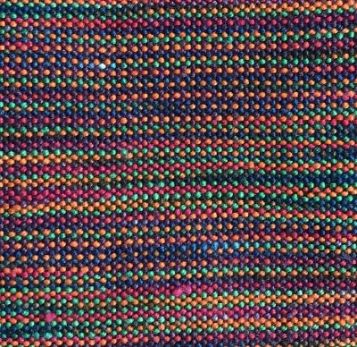
This skein has colors that are 60 degrees apart (blue and magenta), so even though all the colors mix together when woven in a plain weave swatch, the colors remain relatively bright.
Painted skein woven into an equally bright swatch
Solution Two: Keep the colors from mixing
If the colors in your skein don’t follow the Two Primary Rule, though, all is not lost! The key now is to keep them from mixing together. There are two ways of doing it. The first is to separate the shots of color from each other, as colors that aren’t adjacent don’t mix.
The second method is to make the blocks of colors larger. If the blocks are big enough that you can see them clearly and distinctly, the colors won’t blend together.
Separating colors
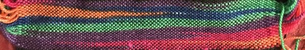
Separating the colors from each other can be as simple as adding a single shot of a different color in between. See how separating the shots of weft yarn makes the colors stand out more?
The image below shows a yarn woven without a separating color on the left, and the same yarn woven alternating with a single shot of black yarn on the right.
Black is a great choice when separating colors, because it is both a neutral color and a dark color. This means that doesn’t change the hue of the colors, and doesn’t attract attention to itself. Alternatively, grays, or any dark, dull colors also have potential – sample to see what works!
Make the blocks of color larger
Another option is to line up the color changes in the yarn so they “pool” together. Here’s a swatch that shows pooling:
It’s not really practical to do this in the weft because it wastes a lot of yarn (that’s an entire bobbin’s worth of yarn in that teeny-tiny swatch!), but it can be done very effectively in the warp without a great deal of yarn waste. To learn more about how to warp so colors pool read this blog about direct warping with palindrome skeins.
And that’s it! I get a lot of requests for help with hand-painted yarns, especially hand-painted knitting yarns, so hopefully you’ll find this useful.
Happy weaving,

From the Course Catalog:
Color Mixing 1 – Explore the magic of color, and how it interacts in woven fabrics.
Hue and Saturation – Learn about some of the fundamental properties of color.
Understanding Value – Learn why value is important, how to judge it, and how to use it in your designs.